
Why House Designing Paint Is the Most Powerful Tool in Your Home Makeover
House designing paint is one of the fastest, most affordable ways to completely transform how your home looks and feels. Before you dive into the full guide, here’s a quick snapshot of what makes neutral paint choices so impactful:
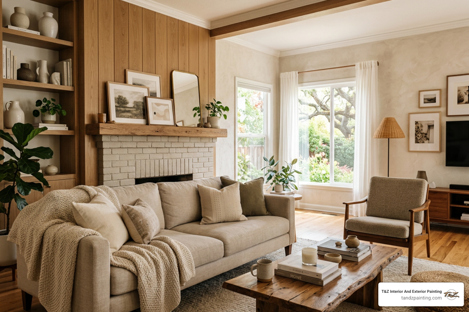
- Soft whites and warm beiges open up small rooms and work with almost any furniture
- Greige and mushroom tones bridge warm and cool elements for effortless flow
- Olive green and sage bring nature-inspired calm to bedrooms and living spaces
- Monochromatic neutrals make compact rooms feel larger by reducing visual breaks
- A 5–7 color whole-house palette keeps every room feeling connected, not chaotic
Neutral doesn’t mean boring. It means intentional. The right neutral can shift the mood of a room, make ceilings feel taller, and tie your entire home together without a single bold color in sight.
Paint color also affects us more deeply than most people realize. Colors influence how we perceive space, how relaxed or energized we feel, and even how large or small a room appears — all before a single piece of furniture is placed.
I’m Tomasz Niemotko from T&Z Interior And Exterior Painting, and with over 13 years of professional experience in house designing paint for homeowners across Lombard and the surrounding suburbs, I’ve seen how the right neutral palette transforms a house into a home. Let’s walk through the neutral ideas that are quietly stealing the spotlight in interior design right now.

House designing paint further reading:
The Art of House Designing Paint: Choosing the Perfect Neutral Palette
Choosing a color scheme is about more than just picking a pretty swatch at the store. When we sit down with homeowners in Wheaton or Downers Grove, we start by looking at the “bones” of the room. Factors like room size, the direction of your windows, and the existing furniture all dictate how a color will actually live on your walls.

According to experts at Architectural Digest, the goal is to create a sense of cohesion. This is where color theory comes into play. You don’t need a degree in art to understand that colors have relationships. A monochromatic palette—using different shades and tints of a single color—can make a room feel incredibly sophisticated and calm. Meanwhile, analogous schemes (colors next to each other on the color wheel, like a soft beige and a muted sage) offer a gentle, natural variety.
At T&Z, our Interior Painting services focus on these nuances. We know that a color that looks great in a sunny, south-facing living room might look like cold concrete in a dim hallway.
Understanding Undertones in House Designing Paint
The biggest mistake we see in DIY house designing paint projects is ignoring undertones. Every neutral has a “secret” color lurking beneath the surface.
- Warm neutrals have yellow, pink, or orange undertones. These make a room feel cozy and inviting.
- Cool neutrals have blue, green, or purple undertones. These feel crisp, modern, and airy.
“Greige”—the love child of grey and beige—has become a staple because it bridges these two worlds. However, you must consider your “fixed elements.” Your flooring, countertops, and cabinets are permanent participants in your color scheme. If your granite has a warm gold fleck, a cool blue-grey wall will likely clash.
We always recommend that you buy paint samples and test them in your actual home. Observe them in the morning light, under your LED bulbs at night, and on a cloudy Illinois afternoon to see how those undertones shift.
Applying the 60-30-10 Rule for Cohesion
To prevent a house from feeling like a “bag of Skittles” where every room competes for attention, designers often use the 60-30-10 rule.
- 60% Dominant Color: This is usually your main wall color in open spaces like the living room and hallways.
- 30% Secondary Color: This could be your Cabinet Painting color, an accent wall, or the upholstery.
- 10% Accent Color: This is for your “pops”—think throw pillows, artwork, or a bold front door.
By following steps to create a stunning whole house paint scheme, you can use architectural breaks like doorways or crown molding to transition between these tones while maintaining a visual flow that feels intentional.
Timeless vs. Trending: Neutral Favorites for 2024
2024 is seeing a massive shift toward “earthy” neutrals. We are moving away from the stark, hospital-white interiors of the last decade and toward colors that feel grounded and sustainable.
One of the most loved shades right now is ‘Setting Plaster’ by Farrow & Ball. It’s a pale, warm pink with yellow undertones that acts as a neutral but adds an incredible glow to a bedroom. Other trending favorites include:
- Mushroom and Taupe: These mid-tones provide more depth than beige but remain completely timeless.
- Olive Green and Sage: These are often called “nature’s neutrals.” They pair beautifully with wood tones and help blur the line between indoors and out.
- Soft Whites: Classics like ‘Slaked Lime’ or ‘Alabaster’ remain the gold standard for a clean, sophisticated look.
Elevating Small Spaces with House Designing Paint
If you are dealing with Small House Painting Challenges, your choice of paint is your best friend. To make a compact room feel larger, we often suggest a monochromatic scheme. By painting the walls, trim, and even the ceiling in the same color (or very close variations), you remove the visual “stop signs” that tell your brain where a wall ends.
There is a lot of debate regarding the pros and cons of painting ceilings the same color as walls. In a small room, doing so can actually make the ceiling feel higher because the eye doesn’t get caught on a harsh white line at the top of the wall. Light reflectivity is also key—lighter neutrals bounce more light around, making the space feel airy.
Creating Flow with a Whole House Palette
A professionally designed home usually follows a 5–6 color rule. This doesn’t mean you only use six colors total, but rather six intentional, repeating tones that create consistency.
The easy way to choose a whole house color palette is to start with one neutral you love for the main living areas and then branch out. For example, a soft greige in the living room can become the vanity color in a bathroom, or a deeper version of that same grey can be used for the kitchen island. This “repetition with a twist” ensures that as you walk from the kitchen to the hallway in your Elmhurst home, the transition feels smooth and polished.
Selecting the Right Finish for Every Surface
The color is the soul of the project, but the finish (or sheen) is the protector. Choosing the wrong finish can lead to shiny walls that show every bump or matte walls that stain the moment a child touches them.
| Finish | Best For… | Durability | Light Reflection |
|---|---|---|---|
| Matte/Flat | Ceilings, low-traffic bedrooms | Low | None (hides flaws) |
| Eggshell | Living rooms, dining rooms | Medium | Soft glow |
| Satin | Hallways, kids’ rooms, kitchens | High | Pearl-like |
| Semi-Gloss | Trim, doors, bathrooms | Very High | Radiant |
| High Gloss | Furniture, accent trim | Maximum | Mirror-like |
When homeowners ask, “Can you paint kitchen cabinets?” our answer is always yes—provided you use the right finish. Cabinets require a durable, moisture-resistant semi-gloss or satin finish to withstand daily grease and cleaning. In high-traffic areas like a Carol Stream mudroom, a satin finish is essential for washability.
Professional Preparation and Execution
You could buy the most expensive paint in the world, but if the walls aren’t prepared correctly, the result will look amateur. At T&Z Interior And Exterior Painting, we believe 70% of a great job happens before the first drop of paint hits the wall.
Our process involves:
- Drywall Repair: We fix every nail hole, crack, and dent.
- Surface Cleaning: Dust and grease prevent paint from bonding.
- Masking and Protection: We treat your home like our own, carefully covering floors and furniture.
- Priming: Essential for ensuring the true color of your house designing paint shines through.
Following a guide on how to prepare a house for painting is the difference between a job that lasts three years and one that looks stunning for a decade. Our licensed and insured teams in Lombard and La Grange take pride in this attention to detail.
Frequently Asked Questions about Interior Painting
How often should I repaint my interior walls?
It depends on the room’s “lifestyle.” High-traffic areas like hallways and kitchens usually need a refresh every 2–3 years due to scuffs and cleaning. Bedrooms and home offices can often last up to 5 years. If you notice fading or if the “vibe” of your home feels dated, it might be time for a change. Quality Interior Painting with premium materials will always last longer than bargain alternatives.
Is it okay to paint my entire house one color?
Absolutely. In fact, many high-end designers, like those at M.Naeve, use a single dominant neutral to create a “blank canvas” feel. This makes a home feel incredibly spacious and cohesive. You can add variety by using different sheens (e.g., eggshell on walls and semi-gloss on trim) or by introducing color through furniture, rugs, and art.
How do I calculate how much paint I need?
The general rule is that one gallon of paint covers about 350 to 400 square feet with one coat. However, most professional results require two coats for full color depth and durability. To calculate, measure the total wall area (length x height) and subtract the area of windows and doors. When in doubt, our team provides professional estimations as part of our Interior Painting consultation to ensure no paint is wasted.
Conclusion
Neutral house designing paint is far from boring—it is the foundation of a sophisticated, harmonious home. Whether you are looking to increase your property value in Plainfield or simply want to create a more relaxing sanctuary in Schaumburg, the right palette makes all the difference.
At T&Z Interior And Exterior Painting, we bring over 15 years of experience to every project. From Lombard to Wilmette, our mission is to provide quality, stunning results through expert craftsmanship and a deep understanding of color. If you’re ready to transform your space with a professional touch, explore our Interior Painting Services and let’s bring your vision to life.