
Color Consultation & Palette Selection in Lombard, IL
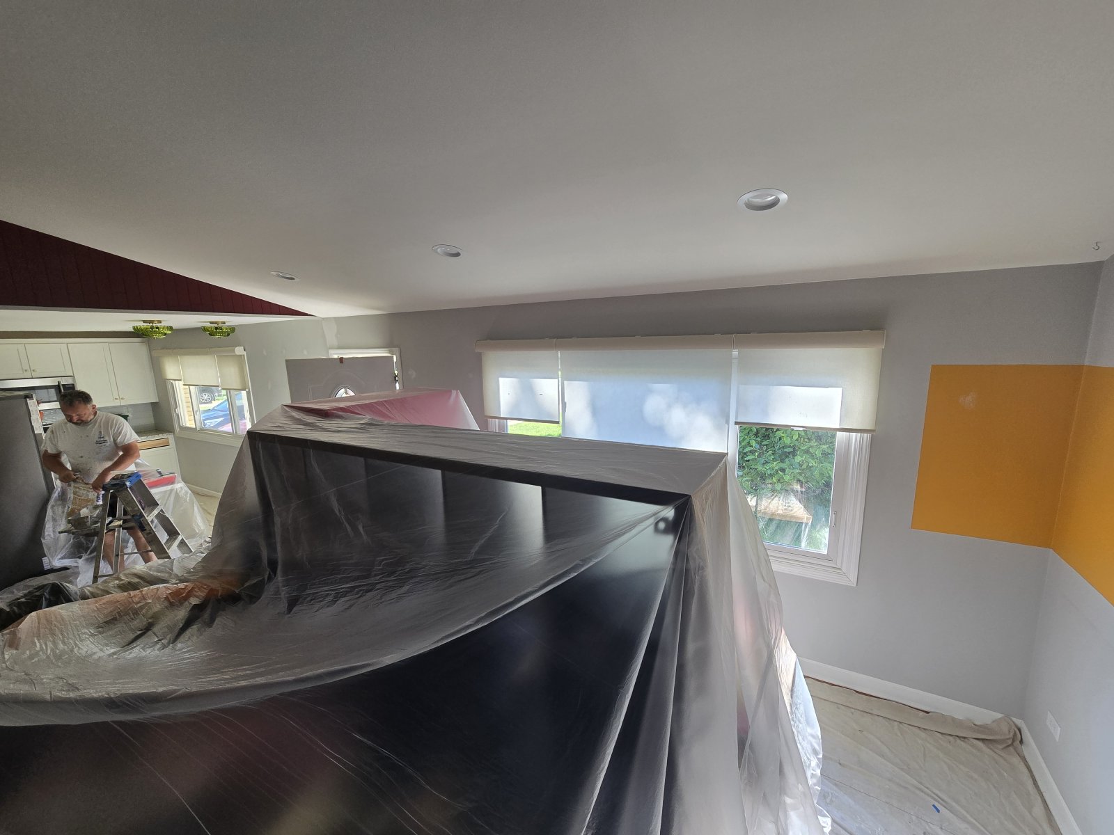
Picking a paint color is easy. Building a palette that works across every room, every surface, and every lighting condition in your home is something else entirely. In Lombard, homeowners who want a cohesive, professionally planned color scheme — not just a wall color — turn to T&Z for Color Consultation & Palette Selection before any painting begins. We develop whole-home and single-room color palettes for residential interiors, open floor plans, commercial spaces, and pre-sale staging — covering every surface from primary walls to trim, ceilings, and accent placements. Schedule an on-site consultation and receive a complete written palette before any painting is committed. We’re a licensed Painter with 15+ years of experience, and we build color palettes from the actual space — not a chip rack — that hold up across seasons, trends, and the full repaint cycle.
What a Professional Color Consultation and Palette Selection Service Delivers in Lombard
The on-site space assessment:
The consultation begins with the space itself. Lighting is the first and most important variable — not what the room looks like in photos or at a specific time of day, but how it reads across the full range of conditions it experiences. A north-facing living room with cool, indirect light needs a completely different palette approach than a south-facing room with direct afternoon sun. A kitchen with warm incandescent pendant lighting over the island operates differently from one with cool LED recessed fixtures. These conditions are assessed on-site because they cannot be observed from a chip rack under store fluorescent lighting.
Architecture and proportion come next. Ceiling height affects how color reads on walls — the same deep color reads as dramatic in a room with 10-foot ceilings and as oppressive in a room with 8-foot ceilings. Window size and placement affect how much natural light modifies wall color. Trim profiles — wide baseboards, deep door casings, crown molding — affect how the trim color relates to adjacent wall surfaces. These are not variables that can be accounted for remotely.
Existing materials — flooring, countertops, cabinetry, tile, hardware, and furnishings — are all assessed for their undertone profiles. The palette is built to work with what’s already in the home, not independently of it.
What the palette includes:
A complete palette for a Lombard home covers more than wall colors. It includes:
A primary color — the dominant neutral that runs through the main living areas and sets the visual character of the home. This color carries the most visual weight and needs to work under every lighting condition in the home, at every time of day.
A secondary color — used in bedrooms, dining areas, or rooms that benefit from a distinct character while still relating to the primary. The secondary shares an undertone direction with the primary so the transition between them reads as planned rather than accidental.
Accent colors — specific surfaces or rooms designated for a deeper, contrasting, or bolder color. The palette specifies where accent color adds dimension and where it would overpower the space.
Trim color — the visual connector that runs through the entire home. A consistent trim color across all rooms creates cohesion regardless of how different the wall colors are between spaces. The trim color recommendation accounts for both the wall colors it borders and the flooring it sits against.
Ceiling color — specified for each distinct ceiling condition in the home. Standard ceiling white in a low-ceiling room reads differently than in a tall-ceiling room. Colored ceilings in specific spaces — a dining room, a bedroom — are considered and recommended where they serve the space.
Sheen level for each surface — flat, eggshell, satin, or semi-gloss specified by surface type and function, not applied uniformly.
The written palette document:
Every T&Z color consultation concludes with a written palette document — specific paint codes for every surface, sheen specifications, and room-by-room notes. This document gives the homeowner a confirmed reference for purchasing and the painter a confirmed specification before any phase of the project begins. Nothing is left to memory or reinterpretation at the paint store.
Lombard homes span 1920s bungalows through 2020s contemporary builds — six distinct architectural eras with characteristic ceiling heights, window proportions, trim profiles, and spatial relationships. The palette approach that works on a 1960s ranch with 8-foot ceilings and small windows reads completely wrong on a 2005 colonial with 9-foot ceilings and a two-story entry. T&Z’s on-site consultation accounts for the specific architectural context of each home rather than applying a standard formula regardless of building type.
How a Color Consultation Differs From Picking Paint — and Why the Difference Matters in Lombard Homes
The fundamental difference — a color versus a system:
Picking a paint color produces a decision about one surface. A color consultation produces a coordinated system that covers every surface in the space and every transition between spaces. The difference is the difference between choosing a wall color for the living room and choosing a palette that makes the living room, dining room, hallway, and kitchen flow together from any vantage point in the open-plan area.
Most homes have more surfaces in more relationships than a single color decision can address. Walls of different heights. Rooms with different light exposures. Surfaces that are seen simultaneously from open doorways and through connected spaces. A system-level approach is the only way to address all of these relationships intentionally.
Light assessment:
The most valuable thing a consultation provides that chip selection cannot is color assessment under the actual light of the actual space. Paint color is not a fixed appearance — it shifts significantly under different light temperatures and intensities. A warm white that reads as creamy and inviting under incandescent lighting reads as yellow and heavy under cool LED. A gray that reads as clean and sophisticated in north-facing natural light reads as purple-toned under warm incandescent.
A consultation assesses proposed colors in the room, under the room’s actual lighting conditions, across the range of conditions the room experiences during the day. This produces a color recommendation that is validated for that specific space rather than for a store environment that has nothing in common with it.
Undertone conflict detection:
Every paint color has an undertone. At chip scale, under neutral lighting, undertones are often invisible or barely perceptible. At room scale, under the room’s actual lighting and next to the room’s actual materials, undertones can become the dominant visual impression.
A consultation identifies undertone conflicts before paint is purchased. A warm cream wall color proposed for a kitchen with cool gray quartz countertops has an undertone conflict that the chip doesn’t reveal and the wall will. A consultation catches it, identifies the specific conflict, and recommends a version of the color that maintains the homeowner’s aesthetic intention while resolving the material conflict.
Whole-home flow:
Room-by-room chip selection produces room-by-room decisions made without reference to each other. The living room color is chosen. Then the dining room color is chosen. Then the hallway is chosen. Each decision feels right in isolation and the full sequence is assembled without any one decision being made in the context of the complete picture.
The result is almost always jarring color transitions at doorways — colors that individually look fine and together look like different people made each decision independently. A consultation plans the full color sequence before committing to any individual room, ensuring that every transition from space to space is intentional and cohesive.
Lombard colonial and split-level homes in Westmore and Maple Knoll — where living, dining, stairwell, and upper-level spaces are all visible from a single vantage point in the entry — make whole-home flow the single most important benefit of consultation over chip selection. These homes read as a unified interior from the moment the front door opens. Room-by-room decisions that seem logical individually produce an incoherent interior at the scale these homes reveal.
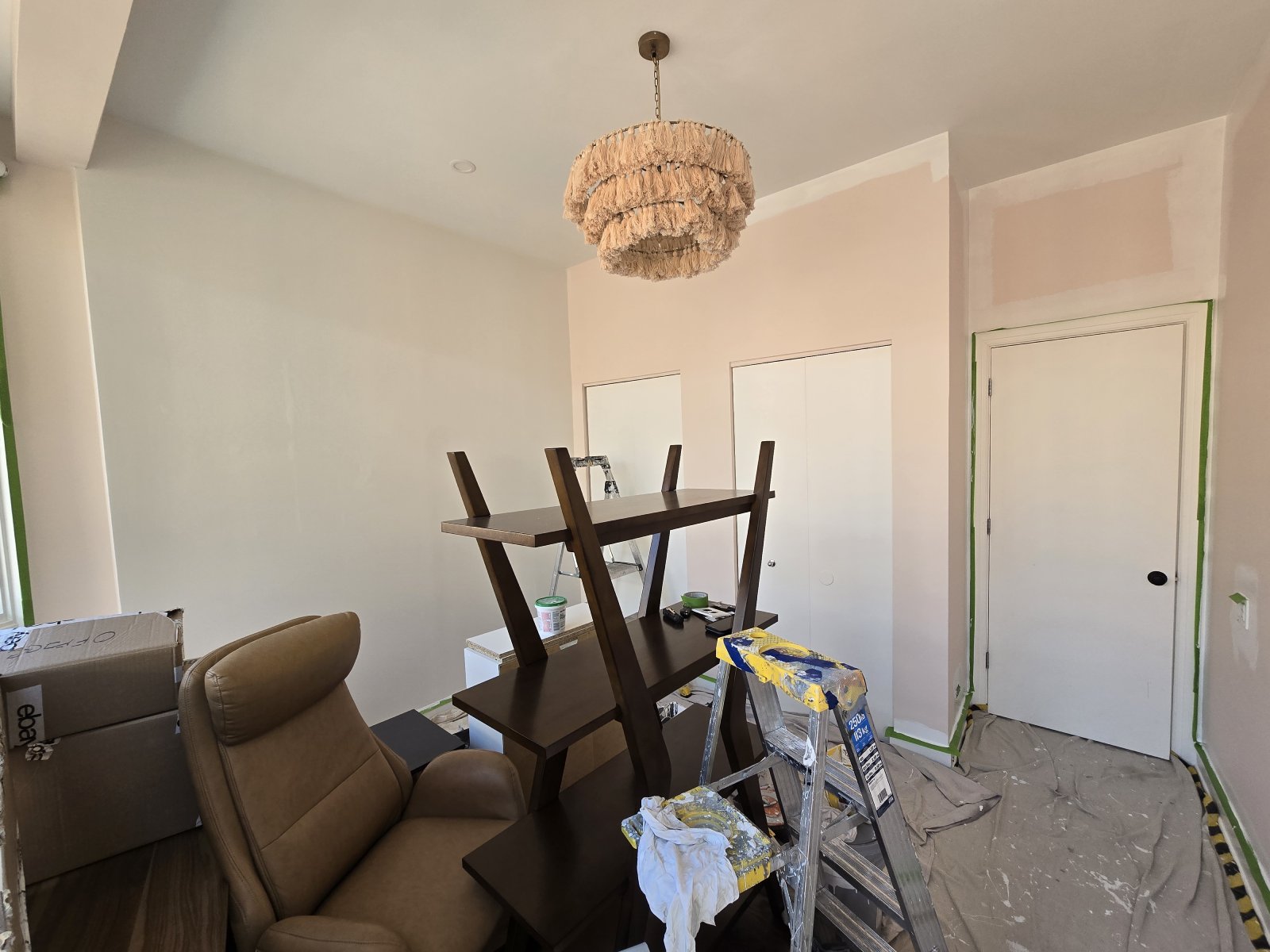
How Many Colors a Well-Designed Lombard Interior Palette Needs — and How They Work Together
The 60-30-10 framework:
A well-designed residential interior uses approximately 60 percent of its visual space in a dominant neutral, 30 percent in a secondary color, and 10 percent in accent color. Applied to a home’s interior:
The dominant neutral — 60 percent — covers the primary living areas, hallways, and any rooms that connect visually to the main living space. This is the color that sets the overall character of the home and the color that everything else is seen against. It needs to be versatile enough to work in rooms with different light exposures and different ceiling heights. Warm off-whites, greiges, and soft warm grays are the most reliable dominant neutrals for Lombard homes.
The secondary color — 30 percent — differentiates specific rooms from the main living areas while relating to the dominant neutral through shared undertone. A master bedroom, a dining room, or a study benefits from a distinct color that has a character of its own while not disconnecting from the palette established elsewhere in the home. The secondary color should share an undertone direction with the dominant neutral — both warm-toned or both cool-toned — even if they’re significantly different in hue.
The accent color — 10 percent — appears in specific, deliberate locations: an accent wall in a key room, the interior faces of built-in shelving, a powder room that gets a bolder treatment, a front door color that translates the interior palette to the exterior. Accent color creates visual punctuation — places where the palette delivers energy and interest rather than just cohesion.
Trim and ceiling as the connective tissue:
The trim color is not part of the 60-30-10 — it’s the frame that makes the whole composition work. Consistent trim color throughout the home creates visual continuity regardless of how different the wall colors are between rooms. The eye moves through the home following the trim as a continuous element — it signals architectural coherence.
Ceiling color follows from the dominant wall color and ceiling height. Standard ceiling white in most rooms. A slightly warmer version of the wall color on lower-ceiling rooms to prevent the ceiling from advancing. A deeper or bolder color on ceilings in specific rooms — a dining room with a coffered ceiling, a bedroom where a colored ceiling replaces an accent wall — where the architectural feature supports the treatment.
The practical number:
A well-designed whole-home interior palette uses three to five distinct colors — dominant neutral, one or two secondary colors, one or two accent colors, trim, and ceiling. More than five distinct colors across the full interior produces visual fragmentation — the home reads as a collection of separate rooms rather than a cohesive environment. Fewer than three on a large home with many distinct spaces produces monotony that no amount of furnishing and décor can fully overcome.
Lombard homes with multiple finished levels — basements, main floors, and upper levels common in colonial and tri-level builds throughout the city — need a palette that works vertically as well as horizontally. T&Z’s consultation maps color decisions across all levels, ensuring the home reads as a unified interior from every floor rather than as separate color schemes stacked on top of each other.
How T&Z Selects Colors for Open Floor Plans in Lombard Homes
Why room-by-room color selection fails on open plans:
The approach that works reasonably well in a traditional closed-room floor plan — choose each room independently and accept that transitions happen behind closed doors — fails completely on an open plan. There are no closed doors. There are no transitions. The kitchen color and the living room color are seen in the same frame from the moment you enter the space.
Homeowners who have approached an open-plan repaint room by room almost always end up with a result they can’t articulate is wrong but can clearly see is uncomfortable. The colors aren’t individually bad — each one might look right in isolation. The problem is that they were chosen without reference to each other, and at open-plan scale, the lack of relationship between them is immediately visible.
The dominant neutral strategy:
The most reliable approach for most open-plan Lombard homes is to run a single dominant neutral across all wall surfaces in the connected zones, using other elements — cabinet color, furniture, accent walls, and architectural treatments — to create differentiation between zones rather than different wall colors.
This approach works because it eliminates the visual boundary problem entirely. There is no jarring transition at the invisible line between the kitchen and the dining area because there is no color change at that line. Differentiation between zones is achieved through ceiling height changes, flooring transitions, furniture arrangement, and pendant lighting rather than wall color — which is exactly how architectural space definition works in well-designed open-plan interiors.
The related-color strategy:
For homeowners who want more visual differentiation between zones than a single neutral provides, closely related colors — same undertone family, differing by value or saturation — can be used in adjacent zones. A slightly deeper version of the dominant neutral on the kitchen wall, with the lighter version continuing into the dining and living areas. The eye reads the two colors as part of the same family and the transition doesn’t read as a boundary because the colors are clearly related.
What this strategy requires: precise undertone management. Two neutrals that look related in isolation can look like mismatched leftovers in the same open-plan space if their undertones diverge. The relationship has to be specific — same undertone direction, controlled value difference — not just approximate.
What to avoid on open plans:
Dramatically different wall colors in adjacent open-plan zones — a warm cream kitchen next to a cool gray dining area next to a navy accent wall in the living room — read as three different rooms that happened to have their walls removed. The color changes become the most prominent visual feature of the space and work against the open, connected feeling the floor plan was designed to create.
New construction and remodeled homes in Yorkshire Woods and Summit at Yorktown frequently have large open-plan great rooms with two-story ceiling sections that create additional vertical color challenges. Where a single-story ceiling section meets a two-story volume, the wall color relationship between the upper and lower portions of the tall wall, and the ceiling color treatment at the transition, require specific attention. T&Z’s on-site assessment addresses these vertical color decisions as part of open-plan palette planning — not as an afterthought discovered during application.
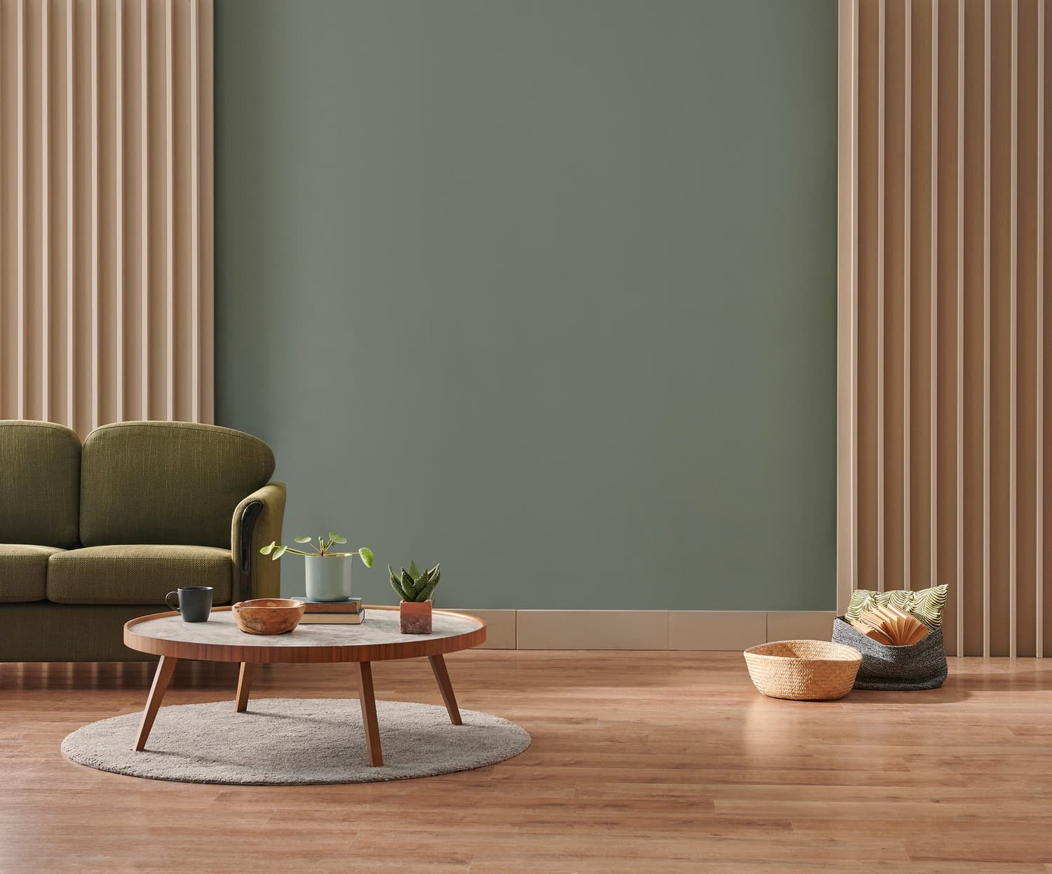
How to Use Current Color Trends in a Lombard Home Without Dating It in Three Years
The trend-versus-timeless framework:
The key is matching the commitment level of the color application to the longevity of the color choice. Trend colors get low-commitment, high-impact locations. Timeless colors get high-commitment, dominant surfaces.
Low-commitment, high-impact locations: an accent wall in a bedroom or living room — one wall, repaintable in a single day. The interior faces of built-in bookshelves. A powder room that gets its own bold treatment. Interior doors painted in a contrasting color. The front door. These are surfaces where a trend color delivers its full visual impact and can be changed without disrupting the entire home when the trend passes.
High-commitment, dominant surfaces: the main living area walls, the hallway walls that connect all spaces, the primary bedroom walls — surfaces that cover hundreds of square feet and require significant labor and disruption to repaint. These surfaces carry the trend for the full repaint cycle. In Lombard, where most homeowners repaint on a seven to ten year cycle, a trend color applied to dominant surfaces in the current cycle will still be on those walls when that color has passed its peak by several years.
What timeless color looks like:
Timeless colors share a few consistent characteristics. They have desaturated, complex undertones — they don’t read as a specific pigment but as a sophisticated neutral with depth. They appear across multiple decades of interior design history without reading as a specific era. They shift character across different lighting conditions rather than looking the same in every room. Warm whites with yellow or red undertones. Greiges with a complex mix of gray, beige, and sometimes green. Soft sage greens that read as neutral in some lights and green in others. Deep navies and charcoals used as accent colors rather than dominant surfaces.
Trend color longevity:
Not all trend colors are equal in their staying power. T&Z advises on which current colors are early in their visibility cycle — still feeling fresh, with likely years of relevance ahead — versus which have already peaked and begun their descent into being associated with a specific moment. This distinction matters more than whether a color is currently popular, because the moment a color application is complete, it begins aging toward its vintage.
The warm terracottas and clay colors currently visible in design media have more longevity than the limewash trend itself — the technique has the shorter cycle, the color family has roots in architectural history that will outlast the specific technique moment. The sage greens of the current cycle have more staying power than the specific warm greens of the early 2010s because they’re cooler and more complex in undertone. These distinctions are what separate current from dated — and they require a level of color knowledge that goes beyond noticing what’s popular right now.
Lombard homeowners repaint on a realistic seven to ten year cycle — longer than most design media assumes. T&Z’s trend versus timeless guidance is calibrated to that cycle, not to a design publication’s editorial calendar that turns over annually and has no stake in how the color looks in year seven.
Color Consultation and Palette Selection for Lombard Commercial Properties — Offices, Retail, and Beyond
What commercial color consultation covers:
Commercial palette development addresses the full building interior as a system. The lobby palette — the brand impression space where clients and visitors form their first judgment about the business. The open office palette — the environment where employees spend the majority of their working day, where productivity, focus, and wellbeing are directly affected by the color and light quality of the space. The conference room palette — where sustained attention is required and visual fatigue needs to be minimized. The breakroom and common area — where a distinct, more personal color creates psychological separation from the work environment.
Each zone has different requirements. Each zone has different existing materials. Each zone has different lighting conditions. Commercial consultation addresses each zone separately and then integrates them into a whole-building palette that reads as planned throughout the building.
Function-first color strategy:
Commercial color is chosen for what it accomplishes, not just for how it looks. The lobby needs to communicate the business’s brand and quality level — the palette decision here is partly a marketing decision. The open office needs to support focus without producing visual fatigue across an eight-hour day — color saturation and value are calibrated to minimize visual fatigue at extended-exposure levels. The conference room benefits from cooler, less stimulating color that keeps attention on the meeting content rather than the walls.
These functional requirements produce specific palette recommendations that are different from what a purely aesthetic approach would generate — and they produce interiors that perform better for the people who use them, not just interiors that look better in photos.
Brand color integration:
For businesses with established brand colors, the consultation integrates brand palette into the physical space — as accent wall treatments, as feature surfaces in the lobby, as the consistent color on reception cabinetry and built-ins. Brand color in the physical environment reinforces brand identity in a way that generic commercial color cannot, and it produces a space that communicates intentionality to every visitor and employee who sees it.
Written commercial palette document:
Every commercial consultation produces a written color specification covering every zone in the building — specific paint codes, sheen specifications by surface and zone, and application notes. Property managers and business owners receive this document before any painting is scheduled so the full palette is confirmed and agreed upon before any work begins.
Professional services businesses in Lombard’s Finley Road and Yorktown office corridors increasingly use interior color strategy as a talent attraction and retention signal. A cohesive, professionally planned office communicates that the business invests in its environment — which communicates something about how it invests in the people who work in it. T&Z’s commercial consultation produces a palette that functions as both brand statement and employee experience rather than as background maintenance.
Send Us a Message
Ready to stop guessing and start planning? Contact T&Z Interior and Exterior Painting today to schedule your on-site color consultation. We serve Lombard and all of Chicagoland — and we deliver a complete written palette before a single drop of paint goes on the wall.
FAQ
What does T&Z's color consultation and palette selection service include for a Lombard home?
An on-site space assessment covering lighting, architecture, and existing materials; whole-home or single-room palette development with primary, secondary, and accent colors; sheen selection by surface type; trim and ceiling color specification; and a written palette document with specific paint codes for every surface — delivered before any painting is scheduled.
How is a color consultation different from picking paint chips at the store for my Lombard home?
Chip selection picks individual colors with no mechanism for catching undertone conflicts, assessing colors under the home’s actual lighting, or planning transitions between rooms. Consultation builds a coordinated system — every color assessed in the actual space, every transition planned as part of a sequence, every undertone conflict identified before paint is purchased.
Can T&Z help with color selection for an open floor plan in my Lombard home?
Yes. Open floor plans are one of the most challenging color scenarios — every zone is seen simultaneously, making room-by-room selection unreliable. T&Z assesses the specific layout on-site and recommends a dominant neutral strategy or closely related color approach that works across all connected zones without jarring visual transitions at the invisible zone boundaries.
How do I use current color trends in my Lombard home without it looking dated in a few years?
Apply trend colors in low-commitment, high-impact locations — accent walls, interior doors, powder rooms — where they can be changed in a day when the trend passes. Apply timeless, desaturated neutrals on dominant surfaces that are expensive and disruptive to repaint. T&Z advises on which current colors have longevity in the cycle versus which are already peaking.
Does T&Z offer color consultation for commercial properties in Lombard?
Yes. Commercial color consultation covers zone-specific palette development — lobby, open office, conference, retail floor, and breakroom — with function-first color strategy, brand color integration, sheen selection by surface and use, and a complete written color specification before any commercial painting begins.