
Color & Material Coordination in Lombard, IL
Paint color chosen in isolation almost always disappoints. The color looked right on the chip, looked right in the store, and looked wrong on the wall — because the wall doesn’t exist in isolation. It exists next to oak flooring, quartz countertops, brushed nickel hardware, and furniture that all have their own undertones, textures, and reflective properties. In Lombard, homeowners updating a room or refreshing a whole home find that Color & Material Coordination is what separates a painting project that looks professionally designed from one that looks freshly painted but somehow off. T&Z Interior and Exterior Painting handles color and material coordination for residential and commercial spaces — paint color integrated with flooring, cabinetry, countertops, hardware, furnishings, and architectural finishes. Schedule an on-site coordination session and receive specific recommendations before any paint is purchased. We’re a licensed Painter with 15+ years of experience and design expertise, and we deliver color decisions that work across every surface in the space.
Why Choosing Paint Color Without Material Coordination Produces Disconnected Results in Lombard Homes
Why isolation produces disconnection:
Every material in a room has an undertone — a secondary color that is embedded in its visual character and becomes more apparent when that material is placed next to other materials. Warm oak flooring has yellow and red undertones. Cool gray quartz has blue and green undertones. Brushed brass hardware has warm yellow-orange undertones. White subway tile with gray grout has a blue-gray cast under cool lighting.
When a paint color is chosen without accounting for these undertones, one of two things happens. Either the wall color shares an undertone with a dominant material and creates a monochromatic wash — everything blends together and the room loses definition. Or the wall color has an undertone that conflicts with the dominant material — a cool gray wall against warm oak flooring creates a visual tension where neither material looks as good as it does in isolation.
Both of these failures are invisible at the chip stage. They appear at room scale, under the specific lighting of the specific room, surrounded by the specific materials in that space.
What coordination produces instead:
When paint color is selected as part of a material system rather than independently of it, the result is a room where every element contributes to the same visual direction. The wall color echoes an undertone in the flooring without matching it too closely. The trim color bridges the wall and floor relationship without competing with either. The ceiling color recedes or activates based on what the room needs — not on what looked good on a chip.
This is what people mean when they describe a room as “put together.” It’s not the individual quality of any material — it’s the relationship between all of them. Coordination is what creates that relationship intentionally rather than by accident.
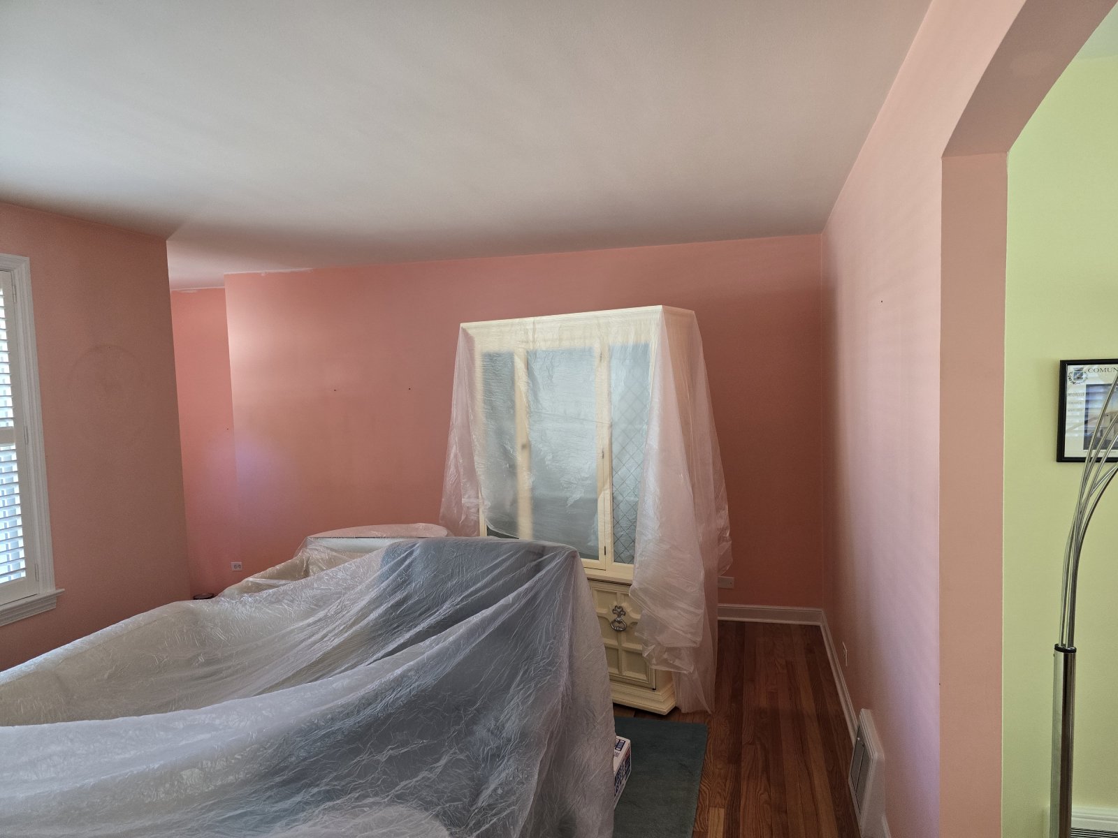
Lombard homes built across six decades carry a wide range of existing material profiles. Warm 1970s oak flooring. Cool 1990s ceramic tile. Contemporary LVP with gray undertones. Granite with complex veining. Quartz in cool whites and warm beiges. The paint coordination that works on one material profile fails on another — and this cannot be assessed from a chip rack under store lighting. It requires seeing the materials together, in the actual room, under the actual lighting conditions of that specific space.
How Color and Material Coordination Makes a Lombard Painting Project Look Professionally Designed
Undertone alignment:
The starting point for material coordination is identifying the undertone of the room’s dominant material — typically the flooring, which covers the most surface area and is seen in relationship to every other material in the room simultaneously. From that undertone, paint color is selected to either harmonize or intentionally contrast in a controlled way.
Harmonizing: a warm oak floor pairs with a warm-undertone wall color — a creamy white, a warm greige, or a muted terracotta. The warmth in the floor is echoed in the wall without being matched too closely. The room reads as cohesive.
Contrasting: a warm oak floor paired with a cool blue-gray wall creates contrast — but only if the specific gray is cool enough to read as a clear contrast rather than a muddy middle ground. This is where undertone precision matters. A gray with pink undertones against warm oak flooring reads as neither warm nor cool — just confused.
Texture and finish pairing:
Material texture affects how paint finish should be specified. Matte walls next to a polished stone countertop — the matte recedes and lets the stone read as the featured surface. Satin walls next to brushed metal hardware — similar sheen levels that read as intentionally matched. High-gloss cabinet doors against a flat-painted wall — the contrast is intentional and makes the cabinets the visual feature.
These relationships don’t happen by default. They require specifying paint finish with awareness of what every adjacent material is doing.
Sheen sequencing:
Every surface in a room has a reflectivity level. Polished stone countertops. Satin-finish cabinet doors. Brushed metal hardware. Textured upholstery. Matte wood flooring. The paint finishes chosen for walls, ceilings, and trim either add to a coherent reflectivity sequence or create visual competition.
Coordination specifies sheen levels that allow each surface to play its role — featured surfaces at higher reflectivity, background surfaces lower. This produces a room where the eye moves naturally to the intended focal points rather than being scattered across multiple competing surfaces.
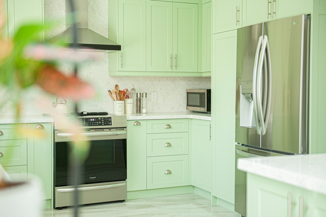
Kitchen renovations in Yorkshire Woods and Summit at Yorktown — where new quartz countertops, updated cabinetry, and new flooring are often installed simultaneously — benefit most from this integrated approach. When all new materials arrive at once, the paint is the last decision and the one that either unifies everything or reveals that the individual elements weren’t chosen in relationship to each other.
How T&Z Coordinates Paint Color With Existing Flooring, Countertops, and Furnishings in Lombard Homes
Existing materials define the most successful options:
A homeowner with warm oak floors, beige granite countertops, and honey-maple cabinets doesn’t have unlimited paint color options — they have a clear material profile that points toward specific color families and away from others. Coordination uses existing materials as the constraint that produces the best result, not a limitation that reduces options.
The on-site material review begins with the flooring because floors are the dominant material in almost every room. T&Z assesses flooring undertone under the room’s actual lighting — the same floor reads differently under warm incandescent light and cool daylight, and the paint color recommendation accounts for both.
The on-site review process:
Countertop and stone assessment: the dominant color in the countertop — its base color, not just the most visible vein — is identified. Veining in granite and quartz is visually active but the base tone is what drives the undertone relationship with wall color. A white quartz with subtle gray veining on a warm beige base needs a different wall color than the same quartz on a cool white base.
Cabinet finish review: the stain or paint tone on cabinet doors, the level of sheen on the cabinet finish, and the door profile (flat versus raised panel) all affect what wall color reads correctly in the kitchen or bathroom. A flat-panel cabinet in a warm cream reads completely differently from a raised-panel door in a honey stain, and the wall color that works behind one is not the wall color that works behind the other.
Hardware metal tone: brushed nickel, oil-rubbed bronze, polished chrome, matte black, and brushed brass all have undertone profiles. Matte black has a slightly cool, blue-gray undertone. Oil-rubbed bronze has a warm brown undertone. Brushed brass has a warm yellow undertone. The wall color in a space is seen next to hardware constantly — coordination aligns paint undertone with the dominant hardware tone in the room.
Furnishing coordination:
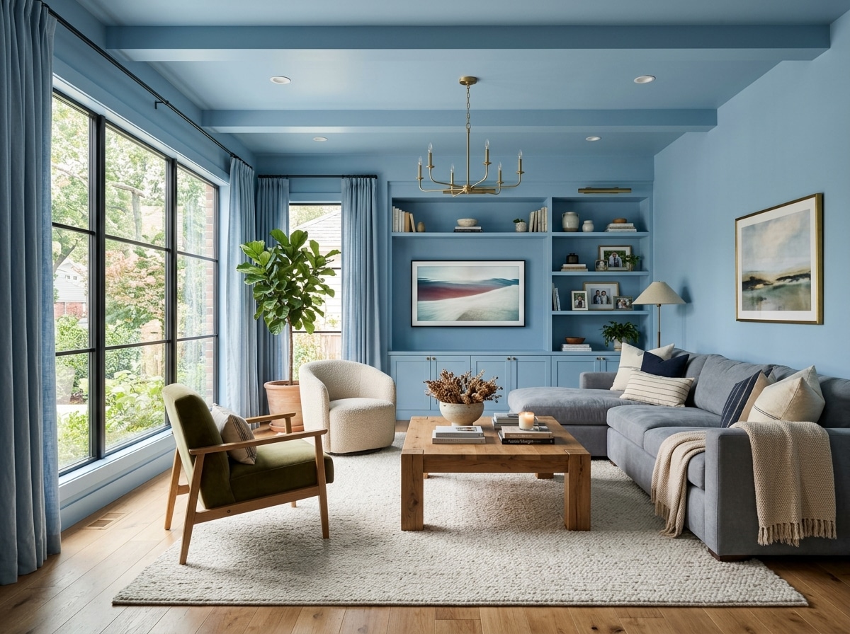
The dominant furniture colors and upholstery tones in a living room, bedroom, or office are factored into wall color recommendations. A living room anchored by a cool gray sectional needs a different wall color than the same room with warm cognac leather. The wall color should support the furniture as the room’s visual focal point — not compete with it.
Lombard homes being refreshed without full renovation — painting walls and trim while keeping existing floors, countertops, and cabinetry — are the most common coordination scenario. T&Z’s on-site review works from what exists and identifies the paint palette that makes existing materials look better, not just different.
Color and Material Coordination for Lombard Commercial Spaces — Brand, Function, and Durability Aligned
Brand integration with commercial materials:
For retail operators and businesses with established brand colors, the coordination session aligns brand paint colors with the physical materials in the space — the flooring material and finish, fixture hardware, display system finishes, and any stone, glass, or metal surfaces that are part of the commercial environment.
Brand colors that look correct on a screen or in a brand guide sometimes need adjustment when placed next to specific flooring materials or fixture finishes in a physical space. A brand color with warm undertones placed next to cool polished concrete flooring creates the same undertone conflict as it would in a residential space — the material context determines whether the brand color reads as intended.
Zone-specific coordination:
Different zones of a commercial interior have different material profiles and different visual requirements. The lobby has tile or polished concrete flooring, reception furniture, and signage materials that all need to be coordinated with the wall color and finish. The open office has carpet or LVP, workstation finishes, and ceiling tile that define the material context. The conference room has a table surface, wall-mounted screens, and often a different floor finish than the rest of the office.
T&Z coordinates paint color and finish recommendations separately for each zone — not a single palette applied uniformly regardless of what each space contains. This is the difference between a commercial interior that reads as intentionally designed and one that reads as uniformly repainted.
Durability alignment:
Commercial finish recommendations account for the cleaning frequency and contact level of each surface. A wall finish that coordinates perfectly with the flooring material but can’t withstand daily wipe-down with commercial cleaners is the wrong finish regardless of its visual quality. Coordination in commercial spaces produces recommendations that are both visually correct and functionally appropriate for how the space is used.
Exterior material coordination:
For commercial properties, the exterior paint selection is coordinated with the building’s cladding material — brick, EIFS, stucco, metal panel, or concrete — as well as any signage, awnings, and storefront hardware. A paint color that reads correctly against brick has a completely different relationship with EIFS or painted metal panel. T&Z assesses the full exterior material palette before recommending an exterior paint color.
Commercial spaces in Lombard’s Main Street and downtown retail corridor often combine polished concrete floors, exposed brick, and metal fixture hardware simultaneously. Coordinating a paint palette that works with all three material types — the warmth of brick, the cool hardness of concrete, and the neutral of metal hardware — requires seeing all three in the actual space and selecting color that bridges them without fighting any of them.
How Color and Material Coordination Before Painting Increases a Lombard Home's Market Appeal
How buyers read material coordination:
Buyers are not consciously evaluating whether wall colors are coordinated with flooring undertones. But they experience the result. A home where everything works together reads as cared for and quality-built. A home where materials conflict — where the paint fights the flooring, where the trim color neither relates to the walls nor contrasts them intentionally, where the kitchen paint looks wrong against unchanged countertops — reads as a project. Buyers translate that reading directly into price sensitivity and contingency requests.
The coordination advantage in listing photography:
Listing photos are where most buyers make their first screening decision. Coordinated palettes photograph significantly better than uncoordinated ones. Color conflicts that are subtle in person are exaggerated by camera sensors and editing. A warm-cool undertone conflict between wall color and flooring reads as a color cast in the photo — the wall appears to have an odd tint, the floor looks a different color than it does in person, and the room reads as smaller and less appealing than its actual dimensions.
A coordination session that produces a palette where wall, floor, trim, and countertop all work together produces photos where the room reads clearly — the space looks its actual size, the materials look their actual colors, and the overall impression is quality.
Pre-sale coordination priorities:
Not every material in a home needs to change before selling. Coordination identifies which paint changes produce the greatest improvement in how existing materials read.
In the kitchen: the wall color is the fastest and least expensive way to change how existing countertops, cabinets, and flooring read. A dated-looking kitchen with original 1990s oak cabinets and existing tile can read as classic rather than dated when the wall color works with the warm undertones of those materials rather than fighting them. Coordination identifies that wall color without requiring any material replacement.
In living areas: trim color is often the highest-impact pre-sale paint change in a room with sound existing wall color. Freshly painted trim in the correct color relative to the wall and floor makes the room look maintained and finished — it communicates that the home has been actively cared for.
In bedrooms: neutral wall color coordinated with the flooring undertone and trim — specifically chosen to photograph well and read as broadly appealing rather than personally expressive — is the standard pre-sale recommendation. Coordination makes the neutralizing decision precise rather than generic.
Lombard homes in Westmore and Maple Knoll with original material profiles — oak flooring, older tile, dated cabinetry — benefit most from this approach. The right paint palette can reframe an unchanged kitchen or bathroom, making existing materials read as intentional and quality rather than as things that need replacing. This is one of the most practical and cost-effective pre-sale investments available.
The Material and Color Conflicts That a Coordination Session Prevents in Lombard Homes
Warm-cool undertone clash:
The most common and most impactful material conflict. Warm-toned wood flooring — oak, hickory, pine — has red and yellow undertones. Cool gray wall color has blue and green undertones. Placed together in the same room, neither material looks as good as it does in isolation. The floor looks more orange. The wall looks more purple. The room reads as visually tense without the viewer being able to identify why.
The resolution requires either moving the wall color warmer — a greige or warm white with yellow undertones that harmonizes with the floor — or committing to a controlled cool-warm contrast with specific undertone management that keeps the contrast deliberate rather than accidental. Coordination identifies which resolution works for the specific floor material, specific room proportions, and specific lighting conditions.
Competing neutrals:
Two neutrals with different undertones in the same space fight each other and make both look wrong. A warm beige wall next to cool gray tile. A cool white ceiling against a warm cream trim. A warm greige wall transitioning to a cool gray in the adjacent room through an open doorway. Each neutral looks right individually and wrong in context.
This is one of the most difficult conflicts for homeowners to self-diagnose because each individual color choice seems defensible — it’s a neutral, it should work anywhere. Coordination identifies undertone relationships between all neutrals in the space and ensures they either share undertone direction or contrast clearly enough to read as intentional.
Sheen competition:
Polished stone countertops, high-gloss cabinet doors, and semi-gloss wall paint in the same kitchen create reflectivity overload. The eye has no surface to rest on — everything is competing for attention at the same reflectivity level. The space reads as busy and uncomfortable without any individual element being wrong.
Coordination specifies which surfaces carry high reflectivity and which ones recede. In a kitchen with polished countertops and semi-gloss cabinet doors, matte or eggshell walls provide the visual rest that allows the featured surfaces to stand out. This relationship doesn’t happen by default — it requires deliberate specification across all surfaces simultaneously.
Metal tone mismatch:
Hardware metal tone is one of the most overlooked material relationships in residential color coordination. Warm brass hardware has yellow-orange undertones. Brushed nickel has cool silver-gray undertones. Oil-rubbed bronze has warm brown undertones. Matte black has a neutral-to-cool undertone.
Wall color that has undertones conflicting with the dominant hardware metal tone creates a low-level visual discord that is difficult to identify but consistently present in the room. A wall color with pink undertones next to brushed nickel hardware. A warm yellow-toned paint against cool chrome fixtures. Coordination aligns paint undertone with the dominant hardware metal in the space — a decision that requires knowing the specific hardware tone, not just the color of the wall.
Pattern and texture conflict:
Textured wall treatments — knock-down, skip-trowel, or faux finishes — adjacent to patterned tile, bold-grain wood flooring, or patterned upholstery create visual competition. When multiple surfaces in the same field of view carry visual activity simultaneously, the eye has no place to land. The room reads as restless.
Coordination identifies when plain, flat finishes serve the space better than textured treatments — specifically in rooms where the flooring, countertops, or furnishings already carry significant visual texture. In bathroom and kitchen updates in older Lombard homes in Westmore — where original tile, existing cabinetry, and new countertops often coexist — this conflict is particularly common. The instinct to add visual interest through a textured wall finish often works against the room when the existing materials are already visually active. T&Z’s on-site review assesses all materials in the space simultaneously and recommends texture or plain finish based on the complete visual context, not on what any individual surface needs in isolation.
Send Us a Message
FAQ
What does color and material coordination include for a Lombard home?
An on-site review of all existing materials — flooring, countertops, cabinetry, hardware, tile, and furnishings — followed by specific paint color and finish recommendations that integrate with every material in the space. A written summary with specific paint codes and sheen specifications for each surface is delivered before any paint is purchased or applied.
Can T&Z coordinate paint color with the existing materials in my Lombard home?
Yes. Existing materials are the starting point, not a constraint. T&Z assesses flooring undertone, countertop base color, cabinet finish, hardware metal tone, and dominant furnishing colors on-site and selects paint that works with what’s already installed — making existing materials look better, not just different.
Does T&Z offer color and material coordination for commercial spaces in Lombard?
Yes. Commercial coordination covers brand color integration with flooring, fixture finishes, hardware, and exterior building materials. Zone-specific recommendations are produced for lobby, retail floor, office, conference, and breakroom areas — each zone treated according to its specific material profile and functional requirements.
How does color and material coordination help when selling a Lombard home?
Coordinated palettes read as maintained and move-in ready, photograph significantly better in listing photos, and eliminate material conflicts that buyers notice and translate into price sensitivity. Pre-sale coordination identifies which specific paint changes make existing materials read as quality and intentional rather than dated or mismatched.
What are the most common material and color conflicts a coordination session prevents?
Warm-cool undertone clashes between flooring and wall color, competing neutrals with conflicting undertones in the same space, sheen competition between polished surfaces and high-sheen paint, metal tone mismatches between hardware and wall color undertone, and texture and pattern conflicts in rooms where existing materials are already visually active.