
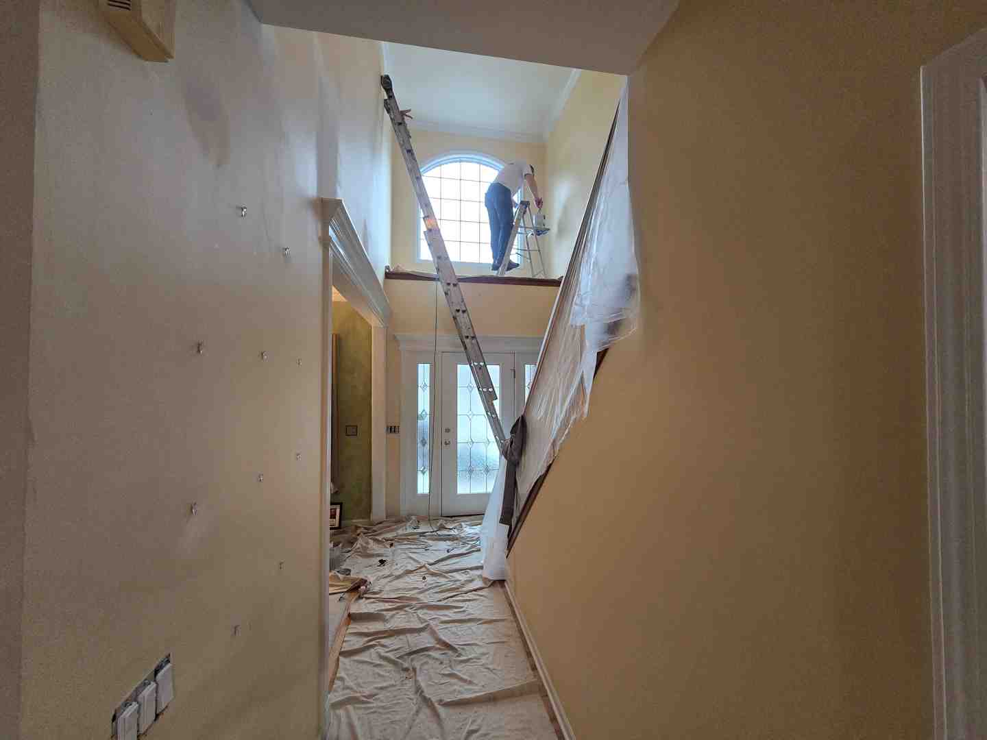
Why Choosing the Right Color for Hall Spaces Matters More Than You Think
The color for hall walls is one of the most impactful — and most overlooked — decisions in your home. Your hall is the first thing guests see. It sets the emotional tone for every room that follows.
Quick answer: Best hall colors at a glance
| Goal | Best Color Choices |
|---|---|
| Make it feel larger | Soft white, light grey, pale blue, warm cream |
| Add warmth and welcome | Terracotta, beige, warm sand, peach |
| Create a luxury feel | Navy blue, deep teal, emerald green, burgundy |
| Stay timeless | Greige, ivory, sage green, off-white |
| Follow 2026 trends | Warm white + sage green, beige + terracotta, off-white + navy |
Nearly 40% of homeowners repaint within a year because they’re unhappy with their first choice. That’s a lot of time, stress, and effort that good planning could prevent.
The hall isn’t just a passageway. It’s where first impressions form and where your home’s visual story begins.
I’m Tomasz Niemotko, owner of T&Z Interior And Exterior Painting, with over 15 years of professional interior painting experience — including transforming hundreds of halls and entryways into spaces that reflect each homeowner’s color for hall vision. In the list below, I’ll walk you through the combinations, techniques, and decisions that actually work.
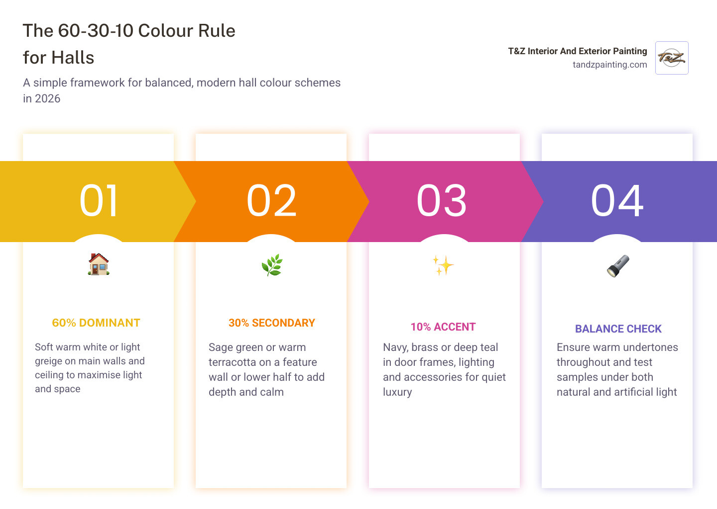
Trending Color for Hall Combinations in 2026
As we move through May 2026, we are seeing a significant shift in how homeowners in Lombard and Wheaton approach their entryways. The days of stark, cold “hospital white” are behind us. Today, the most popular color for hall choices focus on organic warmth and “quiet luxury.”
One of the standout combinations this year is Warm White paired with Sage Green. Sage green is a “healer” in color psychology; it brings the tranquility of the outdoors into your home. When we apply this in local homes, we often suggest using the sage green on a feature wall or even the lower half of the wall (wainscoting) to ground the space, while the warm white keeps the ceiling and upper walls feeling airy.
Warm Terracotta and Clay Tones have also made a massive comeback. These earthy shades provide an immediate sense of “home” and security. They work beautifully in suburban Chicago homes that feature natural wood flooring or stone accents. If you are looking for something bolder, Deep Teal is the “it” accent color of 2026, often replacing traditional navy for those who want a bit more mystery and depth.
For more inspiration on how to apply these modern trends, you can explore Fresh Living Room Painting Ideas for a Modern Home. While trends often emerge globally, such as the Hall Color Combination for Indian Homes: 20 Ideas for 2026, the underlying desire for warmth and personality is universal.

Selecting a Royal Color for Hall Spaces
If your goal is to create a sense of grandeur, you should look toward a “royal” palette. This doesn’t mean your hall has to look like a museum; rather, it’s about using saturated, confident hues that imply quality and history.
- Navy Blue and Ivory: This is a timeless “royal” pairing. The navy provides a structured, formal anchor, while the ivory prevents the hall from feeling like a cave.
- Emerald Green and Muted Gold: We often see this in older, stately homes in areas like La Grange or Downers Grove. Using a deep emerald on the walls and accents of gold (through light fixtures or frames) creates an expensive, curated look.
- Burgundy and Cream: A classic choice for traditional architecture, this combination feels warm and established.
When choosing a royal color combination for a hall, the finish is just as important as the pigment. A semi-gloss or high-end matte finish can make these deep colors look velvety rather than flat.
Modern Neutral and Earthy Palettes
For many of our clients in Carol Stream and Addison, the perfect color for hall is one that provides a seamless transition between various rooms. This is where modern neutrals shine.
- Greige: The perfect bridge between grey and beige. It’s sophisticated and adapts to almost any lighting condition.
- Mushroom and Taupe: These are slightly deeper than standard beige and offer a “stony” feel that looks incredibly high-end when paired with white trim.
- Warm Sand: This is a fantastic alternative to yellow. It provides the same cheerfulness but with a much more grounded, sophisticated edge.
If you’re worried that neutrals might feel “safe” or boring, take a look at our guide on Neutral House Paint Ideas That Are Anything But Boring. The secret lies in the undertones—a neutral with a hint of pink or green can change the entire mood of the entrance.
How Lighting and Layout Influence Your Choice
One of the biggest mistakes we see in DIY projects is choosing a color for hall based solely on a small paint swatch under the bright lights of a hardware store. Your hall’s lighting—both natural and artificial—will drastically change how a color looks.
Natural Light: If your hall has large windows or a glass door, it will likely face a specific direction.
- North-facing halls tend to have a cool, bluish light. To counteract this, we recommend warm-toned paints like peach, creamy whites, or soft yellows.
- South-facing halls receive strong, warm light. You can afford to use cooler tones like pale blues or crisp greys here without the room feeling “cold.”
Artificial Lighting: Most hallways are transitional spaces that rely heavily on lamps or recessed lighting. Warm LED bulbs can turn a crisp grey into a muddy brown, while “daylight” bulbs can make a warm beige look stark. This is why we always emphasize the importance of choosing color for a hallway based on how the space is actually used.
Using Color for Hall Walls to Maximize Small Spaces
Many homes in the Chicago suburbs have narrow or compact entryways. The right color for hall walls can act as a “visual expansion” tool.
The key metric here is LRV (Light Reflectance Value). Every paint color has an LRV score from 0 (black) to 100 (pure white). For small halls, we generally suggest colors with an LRV of 60 or higher.
Soft Whites and Pastels are the champions of small spaces. They reflect the maximum amount of light, pushing the walls “outward” visually. However, you don’t have to stick to white. A pale, dusty blue or a light mint green can provide the same expansive effect while adding a splash of personality.
Another professional trick we use is painting the ceiling the same color as the walls. This removes the “horizon line” where the wall ends, tricking the eye into perceiving more height. You can learn more about this technique in The Ultimate Guide to Painting Your Ceiling and Walls the Same Color.
Professional Techniques: Accent Walls and Color Drenching
To truly elevate a hall, you might want to look beyond the standard “four walls, one color” approach.
Accent Walls: An accent wall is a fantastic way to introduce a bold color for hall spaces without overwhelming the area. We often suggest placing the accent color on the wall you face when you first walk in, or the wall behind a console table. This creates a focal point and gives the eye a place to rest.
Color Drenching: This is a major trend for 2026. Color drenching involves painting the walls, trim, doors, and even the ceiling in the exact same shade. This creates a “cocooning” effect that is incredibly sophisticated. It works particularly well with mid-tone colors like Entrance Hall Pink No.61, which changes beautifully as the light shifts throughout the day. In a narrow hall, color drenching removes the “choppy” look of white baseboards against dark walls, making the space feel more continuous and grand.
Coordinating with Flooring and Decor
Your wall color doesn’t exist in a vacuum. It must play nice with your flooring and furniture.
- Wood Finishes: If you have warm oak or cherry floors, look for wall colors with warm undertones (creams, tans, or warm greens). If you have grey-toned LVP or dark espresso wood, cooler wall tones often work better.
- Tile Matching: For homes in Lemont or Lockport with tiled entries, we look at the grout and the “secondary” colors in the tile. If your tile has a grey vein, a grey-toned wall will tie the room together.
- Furniture Alignment: If you have a dark antique bench in the hall, a lighter wall color will provide the contrast needed to make that piece pop.
A great resource for understanding this balance is the guide on how to find the best paint color for your living room in Plainfield, IL, as the same principles of coordination apply to the hall.
Avoiding Common Hallway Painting Mistakes
Even with the perfect color for hall selected, the execution can make or break the result. One of the most common mistakes is choosing the wrong finish. Hallways are high-traffic zones; they face “fingerprint attacks,” scuffing from shoes, and the occasional bumped vacuum cleaner.
| Finish | Pros | Cons | Best For… |
|---|---|---|---|
| Matte | Hides wall imperfections; deep color look | Harder to clean; can scuff easily | Low-traffic halls or accent walls |
| Eggshell | Low sheen; hides some bumps; wipeable | Not as durable as satin | Most standard hallways |
| Satin | Highly durable; easy to scrub | Shows every wall bump and “ding” | Busy family halls and trim |
Another mistake is ignoring the “nose” of the project. If you are sensitive to smells or have young children, you should consider choosing the right odor sealing paint or looking into sustainable interior paints. Modern, high-quality paints provide better coverage and less “new paint smell,” which is vital in a confined space like a hallway.
Finally, always test your samples on a large area. A tiny 2-inch swatch won’t show you how the color reacts to the shadows in the corner of your hall. We recommend painting at least a 2-foot square on different walls to see how the color shifts from morning to night.
Frequently Asked Questions about Hall Colors
Which color makes a hall look larger?
Light, cool colors are the most effective at making a space feel larger. Soft whites, light greys, and pale blues recede visually, which “pushes” the walls away. Using a high LRV (Light Reflectance Value) paint ensures that whatever light enters the hall is bounced around rather than absorbed.
How do I choose a color for a dark hallway?
In a hall with no natural light, many people instinctively go for bright white. However, white can often look “dingy” or grey in a dark space. Instead, try a mid-tone neutral or a saturated warm color. These colors “embrace” the darkness and create a cozy, intentional feel. Color drenching is also a great solution for dark halls to create a seamless, high-end look.
Should the hall match the rest of the house?
It doesn’t have to match exactly, but it should “flow.” We recommend using the same trim color throughout the house to provide a visual anchor. For the walls, you can use a different shade than your living room, but try to keep the undertones consistent. For example, if your living room is a warm beige, a warm sage green for the hall will feel like a natural transition.
Conclusion
Choosing the right color for hall walls is about more than just picking a pretty shade; it’s about understanding the unique challenges of your home’s layout, lighting, and lifestyle. Whether you are leaning toward the “royal” elegance of navy and gold or the modern tranquility of sage and warm white, the right choice will transform your entrance into a stunning introduction to your home.
At T&Z Interior And Exterior Painting, we take pride in helping homeowners in Lombard, Wheaton, Downers Grove, and the surrounding Chicago suburbs achieve professional, long-lasting results. With over 15 years of experience and a 5.0 Google rating, our team is dedicated to expert craftsmanship and attention to detail. We use top-brand materials to ensure your hall stays beautiful through years of foot traffic.
Ready to give your entrance the makeover it deserves? We invite you to learn more about our interior painting services and see how we can bring your vision to life with precision and care. Paint your way to a stunning entrance today!