
Why the Right Two-Color Bedroom Palette Changes Everything
Finding the best paint combination for bedroom walls is one of the highest-impact decisions you can make when transforming a space. Before a single piece of furniture is noticed, color does the heavy lifting — research from the Pantone Color Institute suggests that nearly 73% of a room’s perceived quality is attributed to its color palette alone.
Here are the top two-color bedroom combinations to consider:
| Color Combination | Best For | Mood Created |
|---|---|---|
| Olive Green + Creamy White | Natural, organic spaces | Calm, grounded |
| Moody Navy + Warm Beige | Modern, sophisticated rooms | Cozy, elegant |
| Light Grey + Blush Pink | Romantic or soft spaces | Tranquil, gentle |
| Sage Green + Terracotta | Earthy, textured rooms | Warm, balanced |
| Muted Teal + Warm White | Bright, airy bedrooms | Fresh, serene |
| Taupe + Dusty Rose | Vintage or cozy spaces | Nostalgic, soft |
| Charcoal + Clay | Bold, contemporary rooms | Dramatic, intimate |
Your bedroom is where your nervous system is supposed to fully unwind. The colors on your walls directly influence that — affecting everything from your heart rate and cortisol levels to how warm or cool the room feels, even at the same temperature.
Yet most homeowners stare at a wall of swatches feeling completely overwhelmed. Too many choices, too many undertones, and too much risk of getting it wrong once the roller hits the wall.
That’s exactly why understanding how colors work together — not just which ones look pretty on a chip — makes all the difference.
I’m Tomasz Niemotko, owner of T&Z Interior And Exterior Painting, with over 13 years of professional painting experience helping homeowners across Lombard and the surrounding suburbs find the best paint combination for bedroom and every other room in their home. In that time, I’ve seen how the right two-color pairing can completely transform a bedroom from forgettable to a space you genuinely look forward to coming home to.

Best paint combination for bedroom terms made easy:
The Science of Sleep: How the Best Paint Combination for Bedroom Walls Affects Your Mood
When we design our homes, we often focus on style. However, the colors you choose for your bedroom walls have a profound physiological impact. Color psychology is not just a marketing concept; it is supported by over 128 years of dedicated psychological theory and research. Your eyes contain specialized receptors that communicate directly with the parts of your brain responsible for regulating your circadian rhythm, hormones, and emotional state.
When planning your next project, it helps to understand how to choose colors for your master bedroom painting project through both an aesthetic and scientific lens. The colors surrounding you as you sleep and wake up can either soothe your nervous system or keep it in a state of low-level alertness.
Why Cool and Muted Tones Win the Night
If your goal is deep, restorative sleep, cool and muted tones are the undisputed champions. Studies show that roughly 88% of people report better sleep quality in bedrooms painted with cool, desaturated tones compared to those with highly saturated, bright walls.
Cool colors—such as soft blues, gentle lavenders, and muted greens—have shorter wavelengths. These wavelengths are less stimulating to the human eye, requiring less cognitive processing and allowing your visual cortex to rest. When you look at a calming, desaturated blue or green, your body naturally downshifts:
- Melatonin Production: Cool tones signal to your brain that it is time to rest, assisting in the natural evening production of melatonin.
- Lowered Cortisol: Soft, quiet hues help reduce stress levels and decrease active cortisol in your bloodstream.
- Heart Rate Reduction: Sighting cool tones can actually encourage a slight drop in heart rate and blood pressure, preparing your physical body for a peaceful transition into sleep.
To explore how these calm, desaturated palettes fit into a broader decorative context, you can read more about building a cohesive bedroom decor color scheme – the decorholic.
The Psychological Impact of Warm vs. Cool Temperatures
While cool colors are scientifically proven to aid sleep, warm tones have their own powerful psychological role to play. Temperature perception is highly subjective and easily influenced by visual cues. In fact, research published in Scandinavian design journals reveals that warm-toned rooms are perceived as up to 3°C warmer than identically heated cool-toned spaces.
- Warm Tones (Terracotta, Peach, Taupe, Warm Beige): These hues have longer wavelengths that stimulate feelings of safety, shelter, and cozy intimacy. They make large, drafty bedrooms feel physically and emotionally protective.
- Cool Tones (Slate Gray, Pale Blue, Sage Green): These colors make spaces feel open, breezy, and incredibly fresh. They are perfect for promoting a clean, uncluttered mental state, though they can sometimes feel slightly clinical if they lack warm accent elements.
The most successful bedroom designs do not rely solely on one temperature. Instead, they find a beautiful harmony between the two. By pairing a cool wall color with a warm accent, or grounding a warm wall with cool, textured bedding, you create a balanced sanctuary that supports both your physical comfort and your sleep quality.
The Designer’s Blueprint: Applying the 60-30-10 Rule to Bedroom Palettes
One of the most common mistakes we see homeowners make is choosing two beautiful paint colors but applying them in equal amounts. When you split a room 50/50 between two dominant colors, your eyes do not know where to rest. The space feels divided and visually chaotic.
To create a balanced, professional-looking bedroom, interior designers rely on a classic formula: the 60-30-10 color rule. This rule serves as a non-negotiable starting point for distributing color across your space to ensure visual harmony. If you are looking for a comprehensive breakdown of how this applies to your entire home, check out the ultimate guide to the best paint combination for house interiors.
Establishing Your 60% Dominant Base
The dominant color makes up roughly 60% of your bedroom’s visual landscape. This color sets the overall mood and acts as the canvas for the rest of your design.
- Where it goes: Typically, the 60% is represented by your main wall paint. It can also include large-scale anchor elements like a major area rug or floor-to-ceiling drapery.
- What to choose: For a bedroom, this should ideally be a relaxing, comfortable hue. Muted neutrals, soft greiges, or gentle, desaturated pastels work wonderfully here.
- Design tip: If you want a clean, sophisticated look that is anything but boring, look into neutral house paint ideas that are anything but boring to find a dominant base that has subtle, rich undertones.
Selecting Your 30% Secondary Tone for the Best Paint Combination for Bedroom Depth
The secondary color accounts for 30% of the room. This is where your two-color wall combination truly comes to life, providing the necessary contrast to keep the room from looking flat.
- Where it goes: In a bedroom, this is your accent wall, your bedding (duvet cover and primary shams), accent furniture like painted nightstands, or secondary textiles.
- How to choose it: Your secondary color should support and enhance your dominant color. It can be an analogous color (sitting next to your dominant color on the color wheel, like sage green next to a soft teal) or a complementary tone that provides a pleasant, soft contrast.
- The visual effect: This secondary layer is what builds depth, making your bedroom feel intentionally styled and layered rather than accidental.
Adding the 10% Accent Spark
The final 10% is your accent color. Think of this as the jewelry of your bedroom. It is a small splash of personality that ties the entire color scheme together.
- Where it goes: Throw pillows, small pieces of artwork, bedside lamp bases, hardware, or a single cozy throw blanket draped at the foot of the bed.
- What to choose: This is your opportunity to introduce metallic elements (like brushed brass, warm copper, or matte black), rich jewel tones, or a highly saturated version of one of your wall colors.
- Why it matters: Without this final 10%, a room can feel unfinished. The accent color draws the eye around the space, creating a dynamic flow that feels curated and cohesive.
7 Stunning Two-Color Combinations for Your Bedroom Walls
Selecting the right two-color pairing is all about finding balance. When done correctly, a two-color combination adds incredible depth, highlights architectural features, and makes your bedroom feel like a custom-designed retreat. If you want to explore how these pairings fit into different design styles, we highly recommend checking out Cozy Bedroom Paint Color Combinations for Every Style – The Paint Color Project.

Below are seven designer-approved two-color paint combinations that are perfect for creating a beautiful, restful bedroom.
1. Olive Green and Creamy White for a Natural Sanctuary
Bringing the outdoors inside is one of the most effective ways to promote mental relaxation. Olive green is a rich, organic, and grounded hue that instantly connects us to nature. When paired with a warm, creamy white instead of a stark, cold white, the result is an incredibly peaceful, comforting sanctuary.
- The Psychological Effect: Green is highly regarded for its ability to reduce stress and encourage a sense of safety and renewal. It is the perfect middle-ground color for those who want a restful space that still feels full of life.
- How to Style It: Use olive green on a focal wall behind your bed, and paint the remaining walls a soft, creamy white. Ground the space with organic textures like a linen duvet, woven rattan baskets, and light-toned wood furniture.
- 2026 Trend Insight: Earthy, organic greens are a major design direction this year. To see how designers are incorporating these natural tones into modern homes, take a look at the curated palettes in Calming Bedroom Paint Colors for 2026 — Tara Nelson Designs.
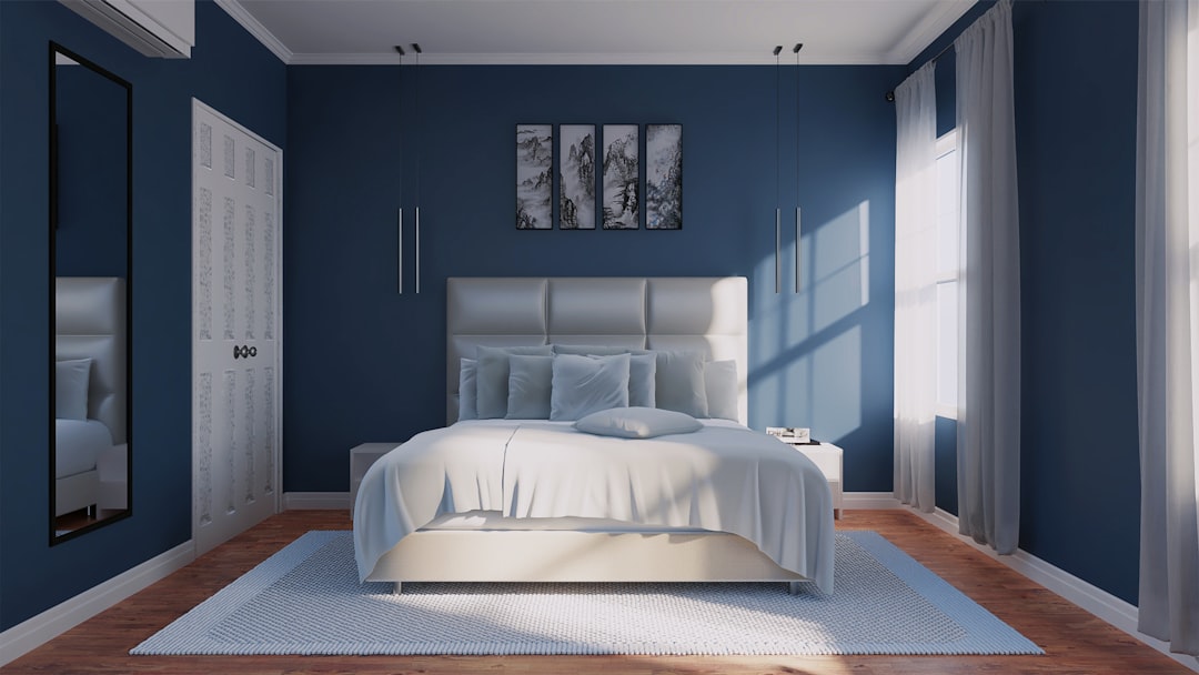
2. Moody Navy and Warm Beige for Modern Elegance
For those who love drama but still want a cozy space to sleep, moody navy and warm beige are a match made in heaven. Navy blue is a timeless, sophisticated color that provides a deep, cocooning effect, while warm beige softens the dark blue and prevents the room from feeling cold or uninviting.
- The Psychological Effect: Deep blues are incredibly soothing to the mind, helping to quiet thoughts after a long, busy day. The warm beige adds a layer of physical comfort and approachable elegance.
- How to Style It: Paint your accent wall in a deep navy (such as Sherwin-Williams Gale Force or Benjamin Moore Hale Navy) and keep the other walls a rich, warm beige or taupe. Integrate warm brass light fixtures and plush textiles to enhance the sophisticated, luxurious feel of the room.
3. Light Grey and Blush Pink for Soft Romance
If you want a romantic, gentle bedroom that does not feel overly sweet or childlike, pairing a cool light grey with a soft blush pink is a beautiful solution. The cool, structured nature of grey perfectly balances the warm, playful energy of blush pink.
- The Psychological Effect: Blush pink is known for its ability to soothe anger and promote feelings of tranquility and gentle warmth. The light grey keeps the space feeling modern, clean, and beautifully balanced.
- How to Style It: Try a “feign-scoting” technique by painting the lower third of your walls a calm light grey and the top portion a soft, airy blush pink. This mimics the look of traditional wainscoting and adds a lovely architectural element to the room. Complete the look with silver or matte black accents.
4. Taupe and Dusty Rose for Vintage Warmth
For a bedroom that feels like a warm, nostalgic hug, look no further than taupe and dusty rose. Unlike bright pinks or stark grays, these colors have heavy brown and gray undertones, making them read as rich, complex neutrals with a hint of vintage charm.
- The Psychological Effect: This combination offers incredible sensory comfort. It feels nostalgic, safe, and deeply relaxing, making it an excellent choice for primary bedrooms.
- How to Style It: Paint the walls a rich, warm taupe and use dusty rose in your secondary elements—such as velvet drapery, a textured duvet, or a painted accent chest. This pairing looks stunning alongside dark wood furniture and vintage brass details.
5. Muted Teal and Warm White for a Fresh Coastal Vibe
If you want your bedroom to feel like a breezy, coastal escape, muted teal and warm white is an exceptional combination. Muted teal combines the calming properties of blue with the refreshing energy of green, while warm white bounces natural light beautifully around the room.
- The Psychological Effect: This palette promotes mental clarity, freshness, and a lighthearted, happy mood upon waking up in the morning.
- How to Style It: Paint your headboard wall in a soft, gray-toned teal (like Sherwin-Williams Halcyon Green or Benjamin Moore Templeton Gray) and paint the remaining walls a bright, warm white. Use light oak furniture, linen bedding, and simple, minimalist decor to keep the space feeling open and airy.
6. Sage Green and Terracotta for Earthy Energy
Sage green and terracotta represent a gorgeous balance of opposing temperatures. Sage is a soft, cool green with heavy gray undertones, while terracotta is a rich, warm clay color that brings immediate life and energy to a space.
- The Psychological Effect: This pairing creates a beautifully grounded, organic balance. The cool sage green calms the eyes, while the warm terracotta adds a touch of creative, welcoming energy.
- How to Style It: Keep your walls primarily sage green to maintain a restful environment, and introduce terracotta through an accent wall, terracotta clay pots, linen throw pillows, or a woven area rug. This palette pairs beautifully with mid-century modern furniture and plenty of indoor houseplants.
7. Charcoal and Clay for Bold Contemporary Drama
If you prefer a modern, minimalist, or industrial aesthetic, charcoal gray and warm clay offer an incredibly chic, contemporary look. This combination is bold, intimate, and perfect for creating a moody, high-end hotel vibe.
- The Psychological Effect: Saturated dark colors like charcoal envelope you, creating a safe, cocoon-like atmosphere that is highly conducive to deep sleep. The clay accents keep the dark gray from feeling sterile or gloomy.
- How to Style It: For a truly bold look, consider “color drenching” the room by painting the walls and trim in a deep charcoal matte finish. Use warm clay on the bedding and in your artwork to create a striking, beautiful contrast that feels cozy and curated.
Crucial Factors to Consider Before Choosing Your Bedroom Paint Colors
Selecting the best paint combination for bedroom walls involves more than just choosing your favorite colors. A color that looks stunning in a magazine or a showroom might look completely different in your home. To ensure you get a result you love, you must consider the unique physical characteristics of your room.
For a deeper look into how paint sheens interact with these factors, take a moment to read our guide on demystifying paint finishes: how to choose the right sheen for every room.
Room Orientation and Light Direction
The direction your bedroom windows face has a massive impact on the quality and temperature of the natural light entering the room. This light will shift dramatically throughout the day, altering how your paint colors appear.
- North-Facing Rooms: These rooms receive cool, bluish natural light all day long. This light can make cool grays, stark whites, and light blues look cold, flat, or slightly clinical. To balance this, choose warm-toned neutrals (like warm beige, creamy whites, or taupes) or colors with warm undertones to keep the space feeling cozy.
- South-Facing Rooms: These spaces are bathed in warm, golden light from morning until afternoon. This light enhances warm colors, sometimes making them look overly yellow or orange. South-facing rooms are perfect for cool-toned blues, sage greens, and crisp grays, which balance the warm sunshine beautifully.
- East-Facing Rooms: These rooms enjoy bright, warm light in the morning, which turns cooler and shadowier in the afternoon.
- West-Facing Rooms: These spaces have cool light in the morning but are flooded with intense, warm, orange-toned light in the late afternoon. Be careful with warm neutrals here, as they can turn quite orange in the evening.
To see how these principles apply to other rooms in your home, you can read about how to find the best paint color for your living room in Plainfield, IL.
Maximizing Small Spaces with the Best Paint Combination for Bedroom Walls
If your bedroom is on the smaller side (under 120 square feet), your paint choices can make a significant difference in how large and open the room feels. The secret to maximizing a small space lies in understanding Light Reflectance Value (LRV).
- What is LRV? LRV is a scale from 0 to 100 that measures the percentage of light a paint color reflects. Colors with an LRV of 60 or higher reflect more light, helping a small room feel brighter and more spacious.
- The Monochromatic Trick: One of our favorite designer secrets for small rooms is painting the walls, trim, and ceiling the exact same color. This eliminates visual breaks, making the boundaries of the room disappear and tricking your eyes into perceiving the space as larger. To learn the pros and cons of this technique, check out the ultimate guide to painting your ceiling and walls the same color.
- Low Contrast: Keep the contrast between your two chosen colors relatively low. High contrast (like black and white) creates sharp visual lines that can make a small room feel segmented and cramped.
The 5-Step Foolproof Paint Testing Method
Never buy paint based on a tiny paper swatch or an image on a phone screen. To avoid costly mistakes, use this designer-proven 5-step testing method:
- Purchase Large-Format Samples: Instead of painting directly on your walls, buy large peel-and-stick paint samples or paint large pieces of white poster board.
- Use the White Paper Test: Hold your paint sample against a piece of bright white printer paper. This instantly reveals the hidden undertones of the paint (such as green, pink, or yellow).
- Test in Multiple Locations: Move your sample boards to different walls throughout the day. Place them next to your flooring, your window, and your bed.
- The 3-Day Observation Protocol: Observe the samples in the morning, afternoon, and night under both natural light and your bedside lamps.
- Compare Side-by-Side: Never look at a color in isolation. Put two or three similar shades next to each other to see which one truly fits your space.
For a comprehensive walkthrough of this process, you can refer to the complete guide to choosing the best bedroom paint colors: a designer’s proven 5-step method – the decorholic.
Frequently Asked Questions About Bedroom Paint Combinations
Choosing the perfect paint can raise a lot of questions. Below, we have compiled a quick-reference table of common paint sheens for bedrooms, followed by answers to some of the most frequently asked questions we hear from homeowners.
| Paint Sheen | Best For | Light Reflection | Cleanability |
|---|---|---|---|
| Matte / Flat | Ceilings, low-traffic walls | None (absorbs light) | Low (hard to scrub) |
| Eggshell | Main bedroom walls | Soft, velvety glow | Moderate to High |
| Satin | Trim, doors, baseboards | Pearl-like shine | Very High |
What is the most relaxing two-color combination for a bedroom?
The most relaxing two-color combinations are those that utilize cool, desaturated tones from nature. Excellent choices include:
- Lavender and Off-White: Creates a peaceful, healing, and quiet environment.
- Sage Green and Creamy White: Promotes a grounded, natural tranquility that lowers stress.
- Soft Blue and Soft Gray: Scientifically proven to help lower heart rate and encourage restful sleep.
To learn more about selecting peaceful pairings, you can read about choosing two colour combination for bedroom walls that feel right.
Should the bedroom ceiling be painted the same color as the walls?
It depends on the mood you want to create.
- Why you should: Painting the ceiling the same color as the walls (especially in a soft neutral or a deep, moody shade) creates an incredibly cozy, seamless, “cocoon” effect. It is also a fantastic way to make small bedrooms feel larger by removing visual boundaries.
- Why you might not: If you have low ceilings or very little natural light, a dark ceiling can sometimes feel heavy. In those cases, painting the ceiling a soft white or a 50% lighter mix of your wall color is a better option.
For a detailed look at this design choice, check out our guide on the pros and cons of painting ceilings the same color as walls.
How do I choose a paint combination if I have dark wood furniture?
Dark wood furniture (like cherry, walnut, or mahogany) anchors a room beautifully. To make it look intentional, you should work with the wood’s natural undertones rather than fighting them.
- Pull Warm Undertones: Choose paint colors that complement the warmth of the wood. Earthy terracotta, warm beige, soft olive green, and deep navy all look stunning against dark wood.
- Avoid Cool Clashes: Try to avoid cold, stark whites or icy blues, which can create an uncomfortable, harsh contrast with warm wood tones.
Conclusion
At the end of the day, your bedroom is your personal retreat—the place where you start and end every single day. Finding the best paint combination for bedroom walls is the foundation of creating a space that truly supports your lifestyle, improves your sleep quality, and brings you joy.
While choosing the right colors is a vital first step, the final result depends entirely on the quality of the application. Even the most beautiful designer palette can fall flat with uneven coverage, sloppy edges, or the wrong paint finish.
If you are ready to transform your bedroom with flawless execution, expert craftsmanship, and premium materials, we are here to help. At T&Z Interior And Exterior Painting, we bring over 13 years of professional painting experience to homeowners in Lombard, IL, and surrounding communities like Wheaton, Lemont, Downers Grove, Carol Stream, and La Grange.
Let us handle the prep work, the clean lines, and the heavy lifting. Contact us today to discuss your vision, and explore our T&Z Interior Painting Services to start planning your dream bedroom transformation.