
Accent Wall Design & Feature Painting in Lombard, IL
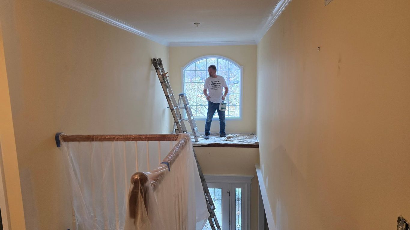
A different-colored wall is not an accent wall. It’s a wall that’s a different color. The distinction matters because the result looks completely different — and homeowners who have painted one wall bold and been disappointed by the outcome understand this exactly. In Lombard, homeowners who want a room that reads as designed turn to T&Z for Accent Wall Design & Feature Painting — a service that combines interior decorator expertise with professional paint application. We design and paint accent walls, fireplace surrounds, ceiling feature treatments, built-in highlighting, geometric painted panels, and architectural feature work for living rooms, bedrooms, entries, stairwells, and commercial interiors. Schedule a free on-site design consultation — feature painting projects start with a plan, not a brush. We’re a licensed Painter with 15+ years of experience and interior decorator expertise, and we produce painted features that look designed into the room rather than applied to it.
What Accent Wall Design and Feature Painting Is — and How It Differs From a Standard Paint Job
What the design phase covers:
Wall selection — identifying which surface in the specific room is the correct candidate for a feature treatment. This is a spatial decision, not an aesthetic one. The correct wall is the one that draws the eye from the room’s primary entry point, anchors the furniture arrangement, and reinforces the room’s architectural intention. It is not simply the largest wall or the wall the homeowner is most aware of.
Technique selection — deciding whether the feature calls for a solid color treatment, a textured application like limewash or venetian plaster, a geometric painted treatment, or a painted architectural highlight on an existing feature like a fireplace surround or built-in shelving. The technique is chosen based on the wall’s dimensions, the room’s architectural character, the ceiling height, and the visual weight the space can support.
Color selection — choosing the specific color in relationship to the room’s full palette. Not a color the homeowner likes independently of the room, but a color that functions correctly in the room — sharing the right undertone relationship with the surrounding walls, working with the flooring and furnishing tones, and delivering the intended level of contrast without creating an undertone conflict.
Integration planning — confirming that the designed treatment works with the room as a whole. A feature wall is not a standalone design element. It exists in relationship to the furniture that faces it, the ceiling above it, the trim that frames it, and the adjacent wall colors that surround it. The design phase ensures the feature reads as part of the room rather than as an intervention in it.
What feature painting adds beyond accent walls:
Accent wall design is one application of feature painting. The broader category includes any surface where paint creates architectural character, visual depth, or spatial definition without structural renovation.
Fireplace surrounds — painting the surround, mantel, and firebox interior in a treatment that makes the fireplace the room’s designed focal point rather than an unused architectural leftover.
Built-in shelving interiors — painting the back panels and interior surfaces of built-in bookshelves, entertainment centers, and display cabinetry in a contrasting or complementary color that makes the built-in read as furniture rather than as painted drywall.
Ceiling treatments — colored ceilings, ceiling medallion surrounds, and coffered ceiling color treatments that create vertical accent and architectural character without touching the walls.
Geometric panel painting — using tape, paint, and precision to simulate board-and-batten paneling, wainscoting, picture-frame molding, or geometric tiled patterns on a plain wall — all achieved with paint.
Stairwell feature walls — the tall, continuous wall surface alongside a staircase, often the single most architecturally impactful surface in a home, treated with a feature technique that announces the home’s design intention from every level.
Lombard homes built across six decades have widely varying architectural character. A 1960s ranch with low ceilings and minimal trim detail needs a completely different feature approach than a 2005 colonial with 9-foot ceilings, crown molding, and a two-story entry. The design phase accounts for the specific architecture of the specific Lombard home before recommending any treatment.
Why Accent Wall Design Produces Different Results Than Simply Painting One Wall a Different Color
The difference between a color decision and a design decision:
A color decision answers the question “what color do I want on this wall?” A design decision answers a different set of questions entirely: Which wall should carry a feature treatment in this room? Why that wall? What is its relationship to the primary entry point? Does the room’s furniture arrangement face it or turn away from it? Does it have an architectural feature — a fireplace, a window grouping, a built-in — that the feature treatment should highlight or work around? Is its proportion right for the technique being considered? What is its relationship to the adjacent wall colors, the floor, and the ceiling?
A color decision that skips these questions produces a wall that is colored but not designed. The room doesn’t look better because color alone, applied to the wrong wall or without the right technique, doesn’t create the focal point or the spatial improvement the homeowner was looking for.
The wall selection problem:
The most common cause of accent wall disappointment is wrong wall selection. Homeowners frequently choose the most obvious wall — the largest, the one they’re most aware of — rather than the correct wall. In many rooms, these are different walls.
The correct wall for a feature treatment is almost always the first wall seen on entering the room. In a living room, this is typically the wall the main seating faces — the wall that the room’s arrangement points toward. In a bedroom, it’s the headboard wall — the wall that anchors the sleeping arrangement and is seen from the doorway. In a dining room, it’s the wall at the end of the dining table seen from the kitchen entry.
A feature treatment on any other wall creates a focal point in the wrong location — a point of emphasis that the room’s arrangement doesn’t direct attention toward, or worse, a point of emphasis that competes with the room’s natural sightline rather than reinforcing it.
The technique problem:
Painting one wall a different flat color is one technique. It’s the lowest-investment and highest-risk option — it either works or it obviously doesn’t, with no middle ground. Limewash, venetian plaster, geometric painted treatments, and painted architectural features all have built-in visual complexity that carries the wall even when the color relationship isn’t perfect. They also require the design decision to be correct — technique alone doesn’t save a wrong wall selection.
The color integration problem:
A color chosen independently of the room produces an accent wall that looks imported into the space rather than grown from it. The most successful accent wall colors are deeply connected to the room’s existing palette — a deeper, more saturated, or more dramatic version of something already present. When a homeowner picks a color they love in isolation and applies it to a wall surrounded by colors it has no relationship to, the accent reads as an arbitrary bold decision rather than a designed one.
Split-level and colonial homes in Westmore and Maple Knoll often have walls that seem like obvious accent candidates but are wrong for the room. A short end wall. A wall behind seating that the room faces away from. A wall with a door, two windows, and a light switch that interrupts any continuous treatment. T&Z’s design assessment identifies the correct wall before any color or technique is selected — because starting from the wrong wall produces the wrong result regardless of how well everything else is executed.
The Feature Painting Techniques T&Z Uses to Create Designed Accent Walls in Lombard Homes
Solid color feature wall:
The foundational technique. A single flat or satin color applied to the designed wall in a significantly deeper, more saturated, or more contrasting shade than the surrounding surfaces. When the wall selection is correct and the color integration is right, a solid color accent wall is one of the most effective design moves available — clean, architectural, and timeless.
The failure mode is visible immediately when the wall selection or color integration is wrong — a flat different color on the wrong wall just looks like a mistake. When it’s right, it looks inevitable.
Limewash:
A chalk-mineral paint applied in layers and manipulated while wet to create soft, organic, layered texture with natural variation across the surface. No two sections of a limewash wall look identical — the variation is part of the effect. The result reads as aged plaster or stone — a material richness that flat paint cannot replicate.
Limewash is highly durable, UV-stable, and breathable. It’s appropriate for any room and any architectural style from traditional to contemporary, making it one of the most versatile techniques in feature painting. It’s particularly effective on large walls in living rooms, dining rooms, and bedrooms where the variation reads as depth rather than unevenness.
Venetian plaster:
A multi-layer trowel application using a specialized plaster compound that cures to a hard, polished, stone-like surface. It has genuine depth — the layers of material create a luminosity that changes with the direction and quality of light hitting the surface. In morning light it reads one way. In evening light it reads completely differently.
Venetian plaster is the most labor-intensive technique and the most architecturally impactful. It suits large surfaces, tall walls, and architectural contexts that can support its visual weight. Two-story entry walls and great room feature walls in Lombard’s Yorkshire Woods and Summit at Yorktown homes are ideal applications — the tall, uninterrupted surfaces allow venetian plaster to show what it does at a scale that smaller walls can’t support.
Geometric painted treatments:
Using precision taping, paint, and careful execution to create geometric patterns — stripes, panels, diamonds, herringbone, chevron, simulated board-and-batten — on a plain wall using paint alone. These treatments add architectural structure and visual complexity to walls that have no inherent architectural character.
Geometric treatments are the primary technique for adding architectural interest to Lombard homes from the 1980s and 1990s — construction that produced large, plain, flat walls with minimal trim detail. A simulated panel treatment or a precision-taped diamond pattern brings architectural character to these walls without construction. The result reads as built-in detail rather than painted decoration.
Painted architectural feature highlighting:
Applying contrasting or complementary paint color to existing architectural features — fireplace surrounds and mantels, built-in shelving back panels, ceiling coffers, door surround profiles, and column capitals — to make those features read as designed elements rather than background structure.
A fireplace surround painted in a deep, saturated color against neutral surrounding walls becomes the room’s focal point in a way that a uniformly painted room never achieves. Built-in shelving with back panels in a contrasting color reads as custom furniture rather than painted drywall. These treatments require no new construction — they use existing architecture as the canvas and paint as the medium.
Ceiling feature painting:
Colored ceiling treatments — a single deep color on the entire ceiling, a ceiling medallion surround in contrasting color, a coffered ceiling with the coffer interiors in a contrasting tone — create vertical accent and architectural character without touching the walls. In rooms where no wall is a good accent candidate, the ceiling is often the strongest feature surface in the room.
Lombard homes from the 1980s and 1990s throughout the city benefit most from geometric painted treatments and simulated panel work — techniques that create architectural character on plain walls without the construction cost of adding actual trim and molding.
Which Rooms in a Lombard Home Support Accent Wall Design — and Which Ones Don't
Rooms that consistently support accent wall design:
Living rooms are the strongest candidates in most Lombard homes. There is typically a clear primary wall — the wall the main seating faces, the wall seen from the room’s entry — that is the natural focal point of the space. This wall has the right proportion, the right sightline, and the right furniture relationship for a feature treatment. The living room accent wall is the most common and most reliably successful feature painting application.
Bedroom headboard walls are the second most common and most successful application. The headboard wall is the wall seen first on entering the bedroom, the wall the sleeping arrangement is anchored to, and the wall seen every morning. A feature treatment here — solid color, limewash, or a geometric panel — anchors the room and creates a designed bedroom that reads as a hotel-quality environment rather than a painted box.
Dining rooms respond well to accent wall design because the dining table is always oriented toward a specific end wall. That end wall — seen from the kitchen entry and from the seating positions — is the natural feature surface. Deep, rich colors and textured techniques like venetian plaster work particularly well in dining rooms because the room is used in the evening under warmer, lower-intensity light that flatters these treatments.
Entry foyers and stairwells are among the highest-impact feature painting applications in Lombard homes. The entry wall is the first and last thing seen in the home. The stairwell wall is visible from multiple floors simultaneously. In both cases, the surface is often tall, uninterrupted, and architecturally appropriate for the most dramatic techniques available.
Rooms that require careful consideration:
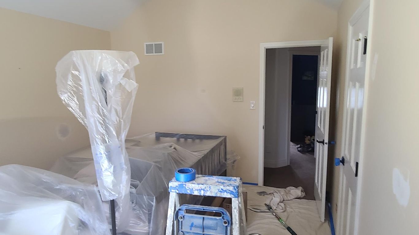
Small bedrooms can support accent wall design — but the wall selection is critical. The wall opposite the door (the one seen from the farthest point in the room) works. A short end wall at the foot of the bed does not — it advances toward the viewer and makes the room feel shorter. A heavily saturated flat color in a very small room requires careful value management to avoid the cramping effect.
Open-plan dining areas connected to kitchens and living rooms often work better with a ceiling treatment than a wall treatment. The ceiling defines the zone without creating a visual wall that interrupts the open connection. A painted ceiling in the dining zone — a deep color or a metallic finish — creates spatial definition that a wall treatment in the same location can’t achieve without disrupting the open-plan character.
Rooms that rarely support accent wall design:
Rooms where every wall has significant interruptions — multiple doors, large windows, HVAC returns, and built-ins — rarely have a surface that can carry a continuous feature treatment. Geometric panel treatments are sometimes the answer here, as they’re designed around interruptions rather than requiring unbroken surface area.
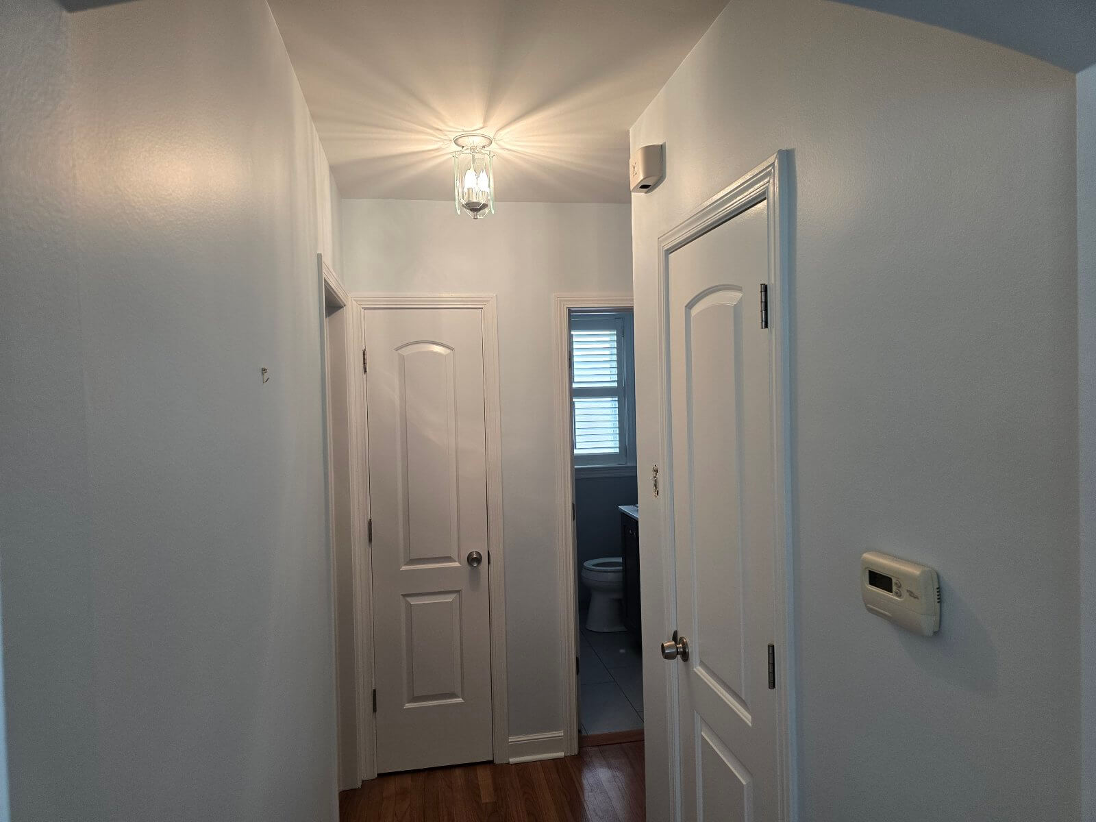
Narrow corridors are the most challenging application. Any accent color in a narrow corridor advances one wall toward the viewer and makes the passage feel narrower. The ceiling is usually the better feature surface in a corridor — a colored ceiling creates interest without changing the perceived width.
Yorkshire Woods and Summit at Yorktown homes with two-story entries and open stairwells have some of the strongest accent wall candidates in Lombard. The tall stairwell wall, visible from both the entry and the upper landing, is the highest-impact single painted surface in these homes. Limewash and venetian plaster on these surfaces create the kind of architectural statement that defines the entire home’s design character from every level.
How to Choose the Right Color for an Accent Wall in a Lombard Home
Start from the room, not the chip rack:
The most reliable accent wall colors are deeply connected to the room they’re going into. They take a color already present in the room’s palette — in the flooring undertone, in a dominant furnishing color, in the surrounding wall tone — and deliver a deeper, more saturated, or more dramatic version of it.
This approach produces an accent that reads as designed into the room because it is. The color belongs to the room’s vocabulary. It didn’t arrive from outside the room’s existing visual language — it grew from it.
A room with warm oak floors, cream walls, and warm brass hardware has a warm color vocabulary. An accent wall in that room should be a warm color — a deep terracotta, a rich cognac brown, a saturated sage green with warm yellow undertones, a deep forest green that echoes the warmth in the floor. A cool blue-gray accent wall in that room conflicts with the warm material context regardless of how much the homeowner loves that specific blue in other settings.
Value contrast versus hue contrast:
The most sophisticated and most reliable accent wall approach creates contrast through value — the relative lightness or darkness of the color — rather than through hue. A room in warm greige walls with a deep mocha, charcoal, or dark olive accent reads as architecturally confident and cohesive. The accent is clearly distinguished from the surrounding walls by its depth, not by introducing a completely different color family.
Hue contrast — placing a color from a different part of the color wheel on the accent wall — can be highly effective but requires precise undertone management. A warm terracotta accent in a cool-gray room works only if the terracotta’s undertone relationship to the surrounding gray is controlled and intentional. Without that precision, the result reads as two colors that don’t belong together in the same room.
Undertone consistency:
Every color has an undertone — a secondary color that becomes more visible at room scale and under specific lighting conditions. An accent wall color that has a different undertone direction than the surrounding walls creates conflict rather than contrast. A warm-undertone accent in a cool-neutral room looks like it arrived from a different design plan. A cool-undertone accent in a warm-neutral room creates the same problem in reverse.
The accent color should share an undertone direction with the surrounding palette even when it differs dramatically in hue or value. This is the invisible quality that makes some accent walls look designed and others look applied.
Testing at scale:
Paint color looks different at chip scale and at room scale. Every proposed accent wall color should be tested at a minimum 12 by 24 inch painted sample applied directly to the wall before committing to a full application. Assess the sample at morning light, midday light, afternoon light, and evening under artificial lighting. The color that reads correctly across all four conditions is the right color for that wall in that room.
This test is not optional on deep, saturated, or complex accent colors. These colors shift the most significantly between chip scale and room scale, and between different lighting conditions. A color that looks perfect on the chip and wrong on the wall is one of the most expensive painting mistakes available — redoing an accent wall requires stripping back to a base and repainting, not just adding a topcoat over a color that doesn’t work.
Lombard homes with limited natural light — north-facing rooms in 1970s and 1980s construction throughout the city — require accent wall color assessment under both natural and artificial light. Colors that read as dramatic and rich in well-lit design media photographs can read as heavy and absorbing in lower-light Lombard interiors at the same saturation level. The large-scale wall sample in the actual room under actual conditions is the only reliable test.
Accent Wall Design and Feature Painting for Lombard Commercial Spaces — From Offices to Hospitality
Office feature painting:
The reception and lobby wall is the most important feature painting application in a commercial office. It’s the brand impression surface — the first thing clients, visitors, and candidates see when they enter the building. A designed feature treatment here communicates that the business is established, intentional, and invested in its environment.
T&Z designs reception feature walls in brand color, in limewash or venetian plaster treatments that communicate quality and material richness, or in geometric painted panel treatments that add architectural character to plain commercial drywall. The design approach depends on the brand’s character, the architecture of the space, and the impression the business wants to make.
Conference room feature walls are a secondary priority in office feature painting. The accent wall opposite the presentation wall — the wall behind the primary seating — anchors the room and creates a designed environment for client and team meetings. Deep, sophisticated colors in flat or low-sheen finishes work best here, minimizing visual competition with presentation content while adding spatial character to the room.
Retail feature painting:
Retail feature walls serve a specific commercial function — they draw customers deeper into the store toward key product displays and create zones within the retail environment. A feature wall at the back of a retail space is a proven technique for increasing customer penetration — it creates a visual destination that pulls shoppers through the full floor.
Brand-consistent feature walls in retail create a coherent in-store brand experience that extends the brand beyond signage and packaging. A carefully designed feature wall in brand color, with the right technique for the space’s proportions and the brand’s visual character, makes the store feel like a branded environment rather than a generic retail box.
Restaurant and hospitality feature painting:
Atmosphere is the primary product in hospitality. Feature painting creates atmosphere at a fraction of the construction cost of architectural renovation. A venetian plaster feature wall in a restaurant dining room creates the material richness of stone or aged masonry without stone or aged masonry. A limewash treatment on a bar feature wall creates warmth and depth that flat painted walls never produce. A deep, saturated ceiling in a dining zone creates intimacy and enclosure that defines the space as a distinct experience within the larger restaurant.
All decorative techniques in commercial hospitality applications are specified for commercial durability and cleanability. A limewash treatment in a restaurant is not the same product as a limewash treatment in a residential living room — the commercial version requires a protective topcoat that allows the surface to be wiped down with cleaning products while preserving the texture and variation that make the technique worth doing. T&Z specifies commercial-grade product systems for all Lombard restaurant and hospitality feature painting projects.
Restaurants and retail businesses in Lombard’s Main Street and downtown corridor use feature painting as a renovation alternative — a venetian plaster or limewash feature wall creates material richness and spatial character at a fraction of what physical cladding or architectural renovation would cost. T&Z designs and executes these treatments with commercial-grade durability built into the product specification from the design phase forward.
Send Us a Message
Ready to turn a wall into a design statement? Contact T&Z Interior and Exterior Painting today for a free on-site design consultation. We serve Lombard and all of Chicagoland — and every feature painting project starts with a plan, not a brush.
FAQ
What is accent wall design and feature painting — and is it different from what a regular painter offers?
Yes. T&Z combines interior decorator design expertise with professional paint application. The design phase — wall selection, technique selection, color integration, and room planning — happens before any painting begins. A regular painter applies color to a wall. T&Z designs the feature and then executes it, producing a result that reads as designed into the room rather than applied to it.
Which room in my Lombard home is the best candidate for an accent wall design?
Rooms with a clear focal wall seen from a primary entry point — living room primary seating wall, bedroom headboard wall, dining room end wall, or stairwell wall in a two-story home. T&Z assesses the specific room on-site and identifies the correct wall based on the room’s sightlines, furniture arrangement, and architectural features before recommending any color or technique.
What feature painting techniques does T&Z offer for accent walls in Lombard?
Solid color, limewash, venetian plaster, geometric painted panel treatments, painted architectural feature highlighting (fireplace surrounds, built-in interiors, ceiling coffers), and ceiling feature painting. The technique is recommended based on the room’s architecture, ceiling height, wall proportions, and the design goal — not on what’s currently popular.
How do I choose the right color for my Lombard accent wall?
Start from the room’s existing palette — the accent color should be a deeper, more saturated, or more dramatic version of a color already present in the room’s vocabulary. Ensure undertone consistency with the surrounding walls. Test the proposed color at large scale (minimum 12 by 24 inches) on the actual wall under actual lighting conditions before committing to the full application.
Does T&Z do accent wall design and feature painting for commercial spaces in Lombard?
Yes — offices, retail spaces, restaurants, and hospitality businesses throughout Lombard. All decorative techniques are specified for commercial durability and cleanability. The design phase produces a plan before any painting begins, covering wall selection, technique, color, brand integration, and product specification appropriate for the commercial use environment.