
Why Exterior Paint Colors for Small Cottages Make Such a Big Difference
The right exterior paint colors for small cottage homes can completely change how your property looks and feels from the street. A well-chosen palette can make a compact home appear larger, highlight charming architectural details, and create that warm, inviting curb appeal that turns heads.
Here are the most popular exterior paint color choices for small cottages:
| Color Category | Examples | Best For |
|---|---|---|
| Soft neutrals | Warm white, cream, greige | Classic, timeless look |
| Pastels | Pale yellow, blush pink, robin’s egg blue | Vintage or storybook charm |
| Nature-inspired | Sage green, stone gray, clay | Woodland or rural settings |
| Coastal tones | Seafoam, soft aqua, driftwood gray | Beachside or lakefront cottages |
| Bold darks | Charcoal, deep navy, forest green | Modern cottage with contrast |
Most homeowners use three to four colors on their cottage exterior — a main siding color, a trim color, and one or two accent colors for the door and shutters. This simple system creates visual balance without overwhelming a small facade.
The key is choosing colors that work with your home’s architecture, your surroundings, and the way natural light hits your walls throughout the day.
I’m Tomasz Niemotko, owner of T&Z Interior And Exterior Painting in Lombard, IL — and after more than 15 years of transforming home exteriors across the Chicago suburbs, I’ve helped countless homeowners nail the perfect exterior paint colors for small cottage style homes that boost curb appeal and stand the test of time. In this guide, I’ll walk you through the palettes, techniques, and professional tips that make the biggest impact.
Easy exterior paint colors for small cottage word list:
Designing with the Best Exterior Paint Colors for Small Cottage Homes
When working with a smaller footprint, color choice isn’t just about personal taste—it is a powerful tool for visual design. Small cottages have a unique architectural density. Because all their features—windows, doors, porches, and gables—are packed closely together, the wrong color combination can make the house look cluttered or smaller than it actually is.
Conversely, the right exterior color palette can create a stunning illusion of spaciousness. Light colors naturally reflect more sunlight, which coaxes the eye into perceiving the walls as further away. This light reflection gives a compact cottage an open, airy, and expansive presence.
When we plan a cottage painting project, we focus on highlighting the home’s natural assets. Instead of trying to hide the smaller scale, we use color to celebrate it. By choosing a cohesive base color and contrasting it strategically with trim and accents, we make those cozy architectural details—like window boxes, brackets, and gables—stand out beautifully. For a head-to-head breakdown of how different approaches perform on smaller properties, take a look at our guide on 10 Painting Ideas for Small Houses Compared.
Timeless Exterior Paint Colors for Small Cottage Siding
If you want a look that will never go out of style, soft neutrals and warm whites are your best friends. Unlike stark, clinical whites that can look harsh under the bright Illinois summer sun, warm whites and rich creams offer a welcoming, gentle glow.
Shades like cream, vanilla, and greige bring out the organic beauty of surrounding greenery without competing with it. For example, a warm white siding paired with a soft gray-green shutter creates an effortlessly elegant look. If you are worried that neutrals might feel a bit too safe, the right undertones make all the difference. You can read more about how to elevate these shades in our article on Neutral House Paint Ideas That Are Anything But Boring.
For those who want to lean into the whimsical, storybook side of cottage living, pastel tones are a fantastic choice. Soft sage greens, pale butter yellows, and dusty robin’s egg blues feel cheerful and historically authentic. These colors harmonize beautifully with cottage gardens filled with hydrangeas, peonies, and climbing roses.
When choosing these softer siding shades, we recommend looking at curated palettes like those featured in Cottage House Colors: Styles, Palettes, and Tips – A House in the Hills to see how different historical and modern cottage colors interact.
Bold Accents for Doors, Shutters, and Trim
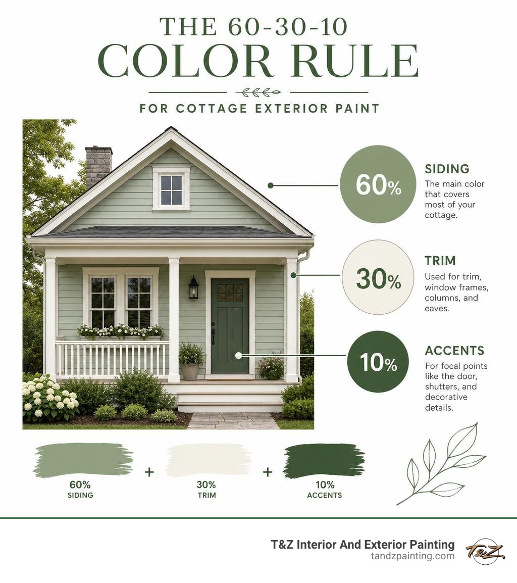
Once you have selected your main siding color (also known as the “field” color), it is time to have some fun with the three-color system. This classic design rule divides your exterior into three roles:
- The Field (60%): Your primary siding color.
- The Trim (30%): Your window frames, fascia boards, and porch railings.
- The Accent (10%): Your front door, shutters, and small decorative details.
For small cottages, we often recommend keeping the trim lighter than the field color. Crisp white or soft cream trim acts like a clean picture frame, drawing attention to your windows and making the overall structure feel organized and bright.
However, if you have chosen a very light neutral for your siding, a dark, high-contrast trim (like charcoal gray or deep bronze) can add a striking, modern edge.
The front door and shutters are where your personality can truly shine. Because these elements make up only about 10% of the home’s exterior, you can go bold without overwhelming the neighborhood. A fiery red, deep navy, or rich forest green front door acts as a welcoming focal point, instantly drawing the eye to your entryway.
To explore some of our favorite high-impact color pairings, check out our resource on Outside House Painting Color Combinations.
Architectural Styles and Environmental Harmony
A small cottage doesn’t sit in a vacuum; it is part of a larger landscape. Whether your home is nestled under mature oak trees in Glenview or sits on a sunny corner lot in Lombard, its exterior colors should harmonize with its natural surroundings and neighboring properties.

When we help homeowners select exterior paint colors for small cottage properties, we always look up and down the street. Achieving “neighborhood cohesiveness” doesn’t mean your house has to blend in so much that it disappears. Instead, it means choosing colors that complement the local environment.
For instance, a cottage surrounded by lush, dark green foliage looks spectacular in earthy tones like warm taupe, soft moss, or even a rich, velvety green that makes the home feel like it sprouted naturally from the earth. To learn more about balancing personal style with environmental harmony, check out the design advice in How Exterior Color Palettes Transform Cottage Curb Appeal | Little Cozy Den.
Matching the Palette to Cottage Architecture
Different cottage styles call for different color treatments to look their absolute best:
- Cape Cod Cottages: These classic homes thrive on coastal-inspired palettes. Think weathered grays, soft blues, and crisp white trim. A slate blue siding paired with white trim and a black or red front door creates a timeless, nautical feel that looks incredibly clean and inviting.
- Craftsman Bungalows: Craftsman style is all about natural materials and earthy, organic colors. Olive greens, warm ochres, deep browns, and brick reds work beautifully here. The goal is to highlight the exposed rafter tails, thick porch columns, and stone details with rich, warm tones.
- English Countryside & Storybook Cottages: These whimsical homes are the perfect canvas for romantic, vintage colors. Think warm creams, dusty lavenders, soft sages, and pale yellows. You can lean into the fairytale aesthetic by using low-contrast trim and adding a playful pop of turquoise or soft pink on the front door.
To dive deeper into the unique characteristics of these styles and how to paint them, explore the Cottage Painting Guide: Transform Your Home into a Charming Storybook Haven – jonathanearley.
How Lighting Affects Exterior Paint Colors for Small Cottage Properties
One of the biggest surprises for DIY painters is how much a paint color can change once it is applied to the outside of a house. This phenomenon is largely due to metamerism—the way a color looks different under varying light sources. A soft, warm gray that looked perfect in the showroom can easily look like a chilly, pastel blue when hit by the bright morning sun.
Your home’s geographic orientation plays a massive role in this:
- North-Facing Homes: These receive cool, indirect light throughout the day. This cool light can make gray and white paints look bluish or cold. To counteract this, choose colors with warm, yellow, or beige undertones.
- South-Facing Homes: These are bathed in warm, intense sunlight for most of the day. This bright light can wash out pale colors, making them look much lighter than they do on a small swatch. You can afford to go slightly deeper or more saturated with your choices here.
Because of these shifting light conditions, we always advise against choosing a paint color based on a paper swatch alone. Instead, apply real paint samples to different sides of your cottage. Watch how the colors change from the soft light of early morning to the golden glow of late afternoon.
For a great real-world example of this testing process in action, read about the journey of Choosing Our Exterior Paint Color — The Tiny Canal Cottage.
Selecting High-Quality Paints for Lasting Durability
Choosing the perfect color is only half the battle; you also need a paint that can stand up to the elements. Here in the Chicago area, our home exteriors endure everything from freezing, snow-heavy winters to hot, humid summers. Cheap paint will quickly crack, peel, and fade under these extreme conditions, leaving your cottage looking tired and unprotected.
At T&Z Interior And Exterior Painting, we exclusively use premium, 100% acrylic latex paints for wood siding. This type of paint acts like a protective, breathable shield. It is flexible enough to expand and contract as temperatures change, which prevents cracking and blistering.
Furthermore, high-quality acrylic paints offer superior UV protection and mildew resistance—two essential features for keeping light cottage colors looking bright and fresh for 10 to 15 years. To understand what makes a paint truly durable, check out our guide on Don’t Let Your Walls Down with These High-Quality Exterior House Paints.
Choosing the Right Sheen for Siding and Trim
The sheen (or gloss level) of your paint affects both how the color looks and how easy it is to clean. Using the wrong sheen can ruin the look of your cottage and make maintenance a nightmare.
Here is a quick comparison table to help you choose the right finish for each part of your cottage:
| Paint Sheen | Characteristics | Best Used For | Why It Works |
|---|---|---|---|
| Flat / Matte | No shine; hides surface imperfections | Stucco, brick, older wood siding | Absorbs light, making uneven surfaces look smoother. |
| Satin / Low Lustre | Subtle, pearl-like sheen; highly durable | Vinyl siding, modern wood siding | The most popular choice for siding; balances durability with a soft look. |
| Semi-Gloss | Noticeable shine; very easy to clean | Trim, window frames, fascia, railings | Creates a clean contrast against matte siding and resists wear. |
| High Gloss | Brilliant, mirror-like shine; maximum durability | Front doors, decorative shutters | Makes accent colors pop and stands up to frequent touching. |
Frequently Asked Questions about Cottage Exterior Painting
What is the best exterior color to make a small cottage look larger?
To create the illusion of more space, stick to light neutrals, warm whites, and soft, airy pastels. Shades like cream, pale gray, and soft sage reflect the maximum amount of natural light, making the walls of your cottage appear to recede. Avoid dark, heavy colors as the primary siding choice if your main goal is visual expansion, as dark colors absorb light and can make a compact home feel more enclosed.
Should the shutter color match the front door on a cottage?
It certainly doesn’t have to! While matching your shutters to your front door is a classic way to create a cohesive look, choosing contrasting colors can add wonderful character. For example, you might paint your shutters a soft, sophisticated gray-blue and make your front door a cheery, welcoming yellow. The key is to ensure both colors belong to the same overall color family so they don’t fight for attention.
How many paint colors should be used on a cottage exterior?
We highly recommend sticking to the classic three-color rule: one primary “field” color for the siding (60%), one contrasting color for the trim (30%), and one bold accent color for the front door and shutters (10%). Using more than three or four colors on a small cottage can make the facade look busy and cluttered, which detracts from its natural charm.
Conclusion
Selecting the right exterior paint colors for small cottage homes is a wonderful opportunity to express your personal style while dramatically boosting your home’s curb appeal and long-term value. By balancing timeless siding shades with playful accents, respecting your home’s architectural style, and choosing high-quality, weather-resistant paints, you can transform your property into a true neighborhood gem.
At T&Z Interior And Exterior Painting, we take immense pride in helping homeowners throughout Lombard, IL, and the surrounding Chicago suburbs bring their dream homes to life. Our experienced team combines meticulous surface preparation with premium materials to deliver stunning, durable results that protect your home for years to come.
If you are ready to give your cottage the professional care it deserves, we invite you to explore our comprehensive tips in The Ultimate Guide to Exterior Painting: Boost Your Home’s Curb Appeal. If you are dealing with a particularly tricky layout, you can also learn more about how we handle tight spaces in our guide to Small House Painting Challenges. Let us help you make your cottage the most charming home on the block!