
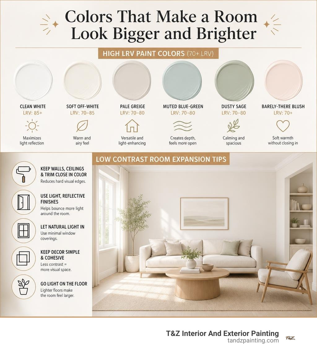
Colors That Make a Room Look Bigger and Brighter
The best colors to make a room look bigger and brighter are light shades with a high Light Reflectance Value (LRV), ideally 70 or higher. Try a clean white, soft off-white, pale greige, muted blue-green, dusty sage, or barely-there blush – then keep the ceiling, trim, and walls close in color to reduce hard visual edges.
For reliable starting points, Benjamin Moore Chantilly Lace (OC-65) has an LRV of 92.2, while Sherwin-Williams Pure White (SW 7005) and Alabaster (SW 7008) have LRVs of 84 and 82. The right undertone matters, too: cool pale blues and greens can make walls seem farther away, while gentle warm whites and blushes help dim, north-facing rooms feel less cold.
I am Tomasz Niemotko, and for more than 15 years I have helped homeowners choose colors to make a room look bigger and brighter as part of quality interior painting projects. At T&Z Interior And Exterior Painting, our licensed and insured team brings 15+ years of experience and a 5.0 Google Reviews rating to homes in Lombard, Itasca, Addison, Glen Ellyn, Oak Brook, and surrounding towns.
Similar topics to colors to make a room look bigger and brighter:
The Science of Space: Light Reflectance Value (LRV) and Directional Light
When we assess a compact room, paint selection is fundamentally an exercise in optical physics. Color directly alters how our optic nerve interprets boundaries, angles, and distances. Two core elements govern this spatial illusion: Light Reflectance Value (LRV) and the color temperature of your light source.
Light Reflectance Value is measured on a strict scale from 0 to 100, indicating the percentage of light a paint color reflects rather than absorbs. A theoretical absolute black scores 0, while a pure, blinding white scores 100. In practical interior applications:
- LRV 85 to 95: Delivers maximum light reflection; ideal for compact layouts under 150 square feet.
- LRV 70 to 84: Measurably opens up walls, pushes visual boundaries outward, and brightens dim corners.
- LRV Below 55: Absorbs ambient light and causes walls to advance toward the viewer, which can make small spaces feel restrictive.

Beyond LRV, undertone wavelengths dictate how the eye perceives wall distances. Short-wavelength cool tones (soft blues, muted greens, cool grays) naturally recede from human vision. They trick the brain into thinking the painted surface is farther away than it physically sits. In contrast, long-wavelength warm tones (saturated reds, warm terracottas, dense oranges) advance, pulling the wall forward.
When you combine a high LRV with a gentle, receding undertone, you create an open, airy backdrop that bounces both natural sun and artificial lamplight across the room. Detailed data on how these metrics perform can be explored in Paint Colors That Make Rooms Look Bigger (With LRV Data).
Understanding Room Orientation and Natural Light
A common decorating pitfall is picking a popular paint swatch without accounting for the compass direction of the room’s windows. The temperature of natural daylight changes significantly based on exposure, which shifts how undertones perform throughout the day:
- North-Facing Rooms: Natural light from the north is cool, dim, and slightly bluish. Pure, stark whites or cool grays often turn dingy, flat, or muddy green in this environment. To counteract the cold light, choose high-LRV creamy off-whites, pale greiges, or soft blush tones with warm undertones.
- South-Facing Rooms: These spaces enjoy warm, golden sunlight all day. Warm whites can occasionally pull overly yellow here, making south-facing rooms the perfect candidate for crisp cool whites, pale blue-greens, and soft celadons that remain crisp under bright exposure.
- East-Facing Rooms: Morning light is bright, warm, and yellow, transitioning into cooler tones by afternoon. Balanced warm neutrals and gentle pales maintain brightness through the changing light levels.
- West-Facing Rooms: Mornings start with duller ambient light, followed by intense, warm, orange-toned afternoon sun. Soft neutrals and muted cool shades help manage the intense afternoon glare while keeping mornings bright.
For windowless spaces or below-grade living areas, matching warm, light-reflective undertones with thoughtful lighting is critical. We dive deeper into these subterranean lighting techniques in our guide on how to paint a small basement to make it feel huge.
Top Designer-Approved Colors to Make a Room Look Bigger and Brighter
Selecting the right paint color requires balancing LRV metrics, undertones, and functional aesthetics. Below is a comparison of proven shades that maximize perceived square footage:
| Paint Color Name | Brand & Code | LRV Score | Undertone Profile | Best Natural Light Exposure |
|---|---|---|---|---|
| Chantilly Lace | Benjamin Moore OC-65 | 92.2 | Clean, ultra-neutral white | South, East, West |
| Simply White | Benjamin Moore OC-17 | 89.5 | Warm, subtle yellow-cream | North, East, Low Natural Light |
| White Dove | Benjamin Moore OC-17 | 85.4 | Soft, muted creamy-gray | North, All Exposures |
| Pure White | Sherwin-Williams SW 7005 | 84.0 | Neutral, slight warm drop | All Exposures, Low Light |
| Alabaster | Sherwin-Williams SW 7008 | 82.0 | Cozy warm beige-white | North, East, Windowless |
| Classic Gray | Benjamin Moore OC-23 | 74.0 | Ultra-pale warm greige | South, West, Bright Rooms |
| Eider White | Sherwin-Williams SW 7014 | 73.0 | Cool, subtle gray-violet | South, West |
| Palladian Blue | Benjamin Moore HC-144 | 60.5 | Soft receding blue-green | South, East, Bathrooms/Bedrooms |
High-LRV Whites and Off-White Colors to Make a Room Look Bigger and Brighter
White remains the classic choice for opening up compact rooms, but picking the wrong white can backfire. Pure, un-tinted stark white creates high contrast against flooring, doors, and furniture, which can draw attention to tight corners and wall imperfections.
Instead, we recommend nuanced, high-LRV whites that reflect ample light while preserving warmth:
- Benjamin Moore Chantilly Lace (OC-65, LRV 92.2): One of the cleanest, brightest whites on the market. It carries virtually no heavy undertones, making it exceptional for living rooms, hallways, and open spaces receiving plenty of natural light.
- Sherwin-Williams Pure White (SW 7005, LRV 84.0): A versatile designer favorite. It has just a hint of warmth to prevent it from feeling clinical or cold, making it dependable across rooms with mixed lighting.
- Sherwin-Williams Alabaster (SW 7008, LRV 82.0): If cool whites feel too stark for your home, Alabaster provides a rich, creamy warmth without skewing overly yellow. It softens shadowy corners in compact entryways and bedrooms.
- Benjamin Moore Classic Gray (OC-23, LRV 74.0): An ultra-light greige that functions like an off-white with added depth. It gently bounces light while establishing an elegant, modern perimeter.
For a broader breakdown of how light neutrals perform in various home layouts, explore our 10 painting ideas for small houses compared.
Atmospheric Cool Tones: Blue-Green and Sage Colors to Make a Room Look Bigger and Brighter
You do not have to limit your palette strictly to whites to make an interior feel spacious. Desaturated, atmospheric cool tones trick the human eye into perceiving distance because cool wavelengths visually recede.
- Soft Blue-Greens: Colors like Benjamin Moore Palladian Blue (LRV 60.5) combine the spatial expansion of sky blue with the organic calm of green. Applying a soft blue-green on the farthest wall of a narrow layout or across an entire compact bedroom softens the perimeter and makes walls feel farther away.
- Dusty Sage: Muted, gray-tinted sage greens bring nature indoors without overwhelming small square footage. Because dusty sage has gray undertones, it grounds architectural features like built-in shelving or wainscoting while keeping the overall room open.
- Powder Blues: Pale, silvery sky blues reflect light effortlessly while giving ceilings and walls an expansive, atmospheric quality.
To see how these cool tones work in personal retreats, check out our practical guide to cool blues for small bedrooms.
Unexpected Space Expanders: Barely-There Blush and Soft Yellows
If cool colors feel too detached for your taste, select warm shades can expand space by generating their own visual warmth:
- Barely-There Blush: Subtle, grayed-out blush tones act as warm neutrals. In north-facing rooms or dim hallways, blush bounces ambient light with a soft, flattering glow, transforming cold shadows into warm perimeters.
- Muted Buttermilk and Pale Yellow: Yellow has inherently high reflectivity. A soft, pale yellow in a windowless laundry room, breakfast nook, or guest bath simulates sunlight, uplifting the room and making compact walls feel bright and cheerful.
- Light Peach and Soft Coral: Muted peach shades reflect warm artificial lamplight beautifully during evening hours, keeping intimate spaces cozy without making the walls feel restrictive.
For more inspiration on soft, restorative palettes, read the definitive guide to calming colors for small bedrooms.
Strategic Painting Techniques and Sheen Selection to Maximize Space
Color selection is only half the battle; how and where you apply paint significantly affects spatial perception. By coordinating architectural transitions, you can guide the eye smoothly across the room without visual interruptions.
A proven guideline for balanced palettes is the 60-30-10 interior design rule:
- 60% Dominant Color: The main wall color (ideally a high-LRV neutral or pale tone).
- 30% Secondary Color: Applied to large furniture, area rugs, or drapery.
- 10% Accent Color: Concentrated in art, throw pillows, or decorative hardware to add depth without cluttering the room.
For additional ideas on utilizing spatial palettes, review 15 Colors that Make a Room Look Bigger and Brighter.
Monochromatic Trim, Ceiling Treatments, and Accent Walls
Traditional interior painting often pairs colored walls with bright white trim and dark baseboards. While classic, high-contrast borders break a room into smaller visual segments, emphasizing limited square footage.
- The Monochromatic Advantage: Painting walls, baseboards, door frames, and crown molding the same color eliminates hard visual stops. The National Kitchen and Bath Association highlights the monochromatic wall-to-trim approach as one of the top space-expanding strategies for layouts under 150 square feet.
- Lifting Low Ceilings: A dark ceiling can optically compress room height by nearly 20% in standard eight-foot rooms. To raise visual height, paint the ceiling the exact same color as the walls, or dilute the wall paint formula by 50% for the ceiling. Alternatively, a soft sky blue on the ceiling draws the eye upward, mimicking the open sky.
- Strategic Feature Walls: While dark colors on all four walls can compress a small room, a deliberate dark accent wall (such as deep charcoal, navy, or hunter green) placed on the farthest narrow wall of a room can create visual depth, making the room appear longer.
Choosing the Right Sheen and Testing Paint Swatches
Paint sheen dictates how light interacts with the wall surface. Higher gloss reflects more light, while flatter sheens absorb it:
- Ceilings (Flat / Matte): Ceilings should almost always receive a dedicated flat ceiling paint. Flat sheens absorb light evenly, hiding drywall seams and imperfections while preventing distracting glare from overhead fixtures.
- Walls (Eggshell): Eggshell is our top recommendation for residential living spaces, bedrooms, and hallways. It provides a soft, satin-like surface that gently bounces natural light without highlighting drywall textures or minor blemishes.
- Trim, Doors, and Cabinets (Satin or Semi-Gloss): Using a satin or semi-gloss finish on trim, doors, and architectural molding adds subtle contrast and durability, creating crisp, clean transitions that frame the room neatly.
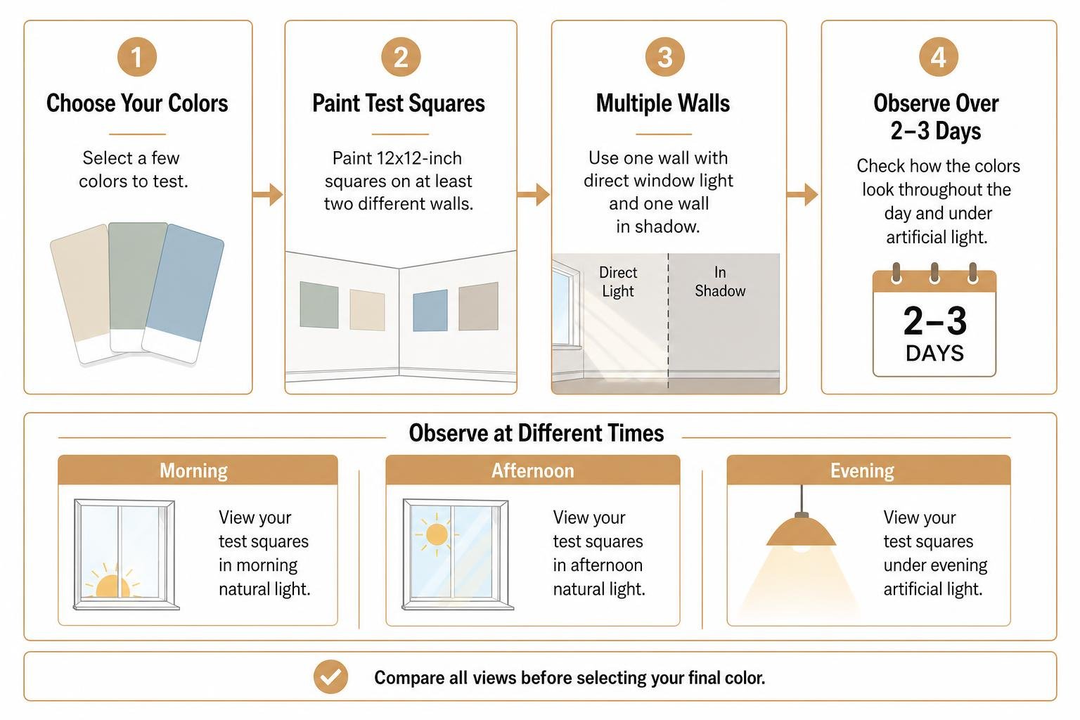
Before committing to a full repaint, never rely solely on a 2-inch paper swatch under store lighting. Purchase sample pots and paint 12×12-inch test squares directly on at least two different walls (one receiving direct window light, and one in shadow). Observe the swatches over a 2- to 3-day period in the morning, afternoon, and under your evening artificial lighting.
When you are ready to update your home, our team provides expert preparation and application through our services/interior painting.
Frequently Asked Questions About Room Brightening Paints
Can painting the ceiling the same color as the walls make a low room look taller?
Yes. When the ceiling matches the wall color, you eliminate the crisp dividing line where the wall ends and the ceiling begins. Without that hard horizontal border, the eye travels continuously upward, making low eight-foot ceilings feel airier and less restrictive.
Why did my bright white paint make my small room look dull and gray?
This typically happens when a crisp, cool white with blue or gray undertones is applied in a north-facing room or a space with limited natural daylight. Cool whites rely on strong, warm sunlight to look bright. Without it, they reflect the dim, cool ambient shadows, resulting in a flat, dingy appearance. A warm off-white or light greige with an LRV above 80 solves this issue.
Does paint sheen really affect how large a room feels?
Yes. Matte and flat finishes absorb light, which can make walls feel slightly heavier. Higher sheens like semi-gloss reflect light easily, but using semi-gloss across an entire wall can create harsh hot spots and highlight every drywall patch or surface flaw. An eggshell finish offers the ideal balance, providing gentle light bounce while maintaining smooth, uniform walls.
Conclusion
Making a compact or dimly lit room feel open, welcoming, and expansive comes down to strategic color choices: selecting high-LRV paints (70+), matching undertones to natural light exposure, and eliminating high-contrast borders along trim and ceilings.
Achieving clean lines and flawless light reflection requires thorough drywall preparation, precise edging, and expert application. At T&Z Interior And Exterior Painting, we bring over 15 years of residential painting experience, full licensing and insurance, and a 5.0 Google Reviews rating to homeowners throughout Lombard, Itasca, Addison, Glen Ellyn, Oak Brook, and the surrounding Chicagoland communities.
Whether you are refreshing a single room, completing a full interior transformation, updating kitchen cabinets, or working through small house painting challenges, our team is here to deliver exceptional, lasting results. Contact us today to schedule your professional interior painting consultation.