
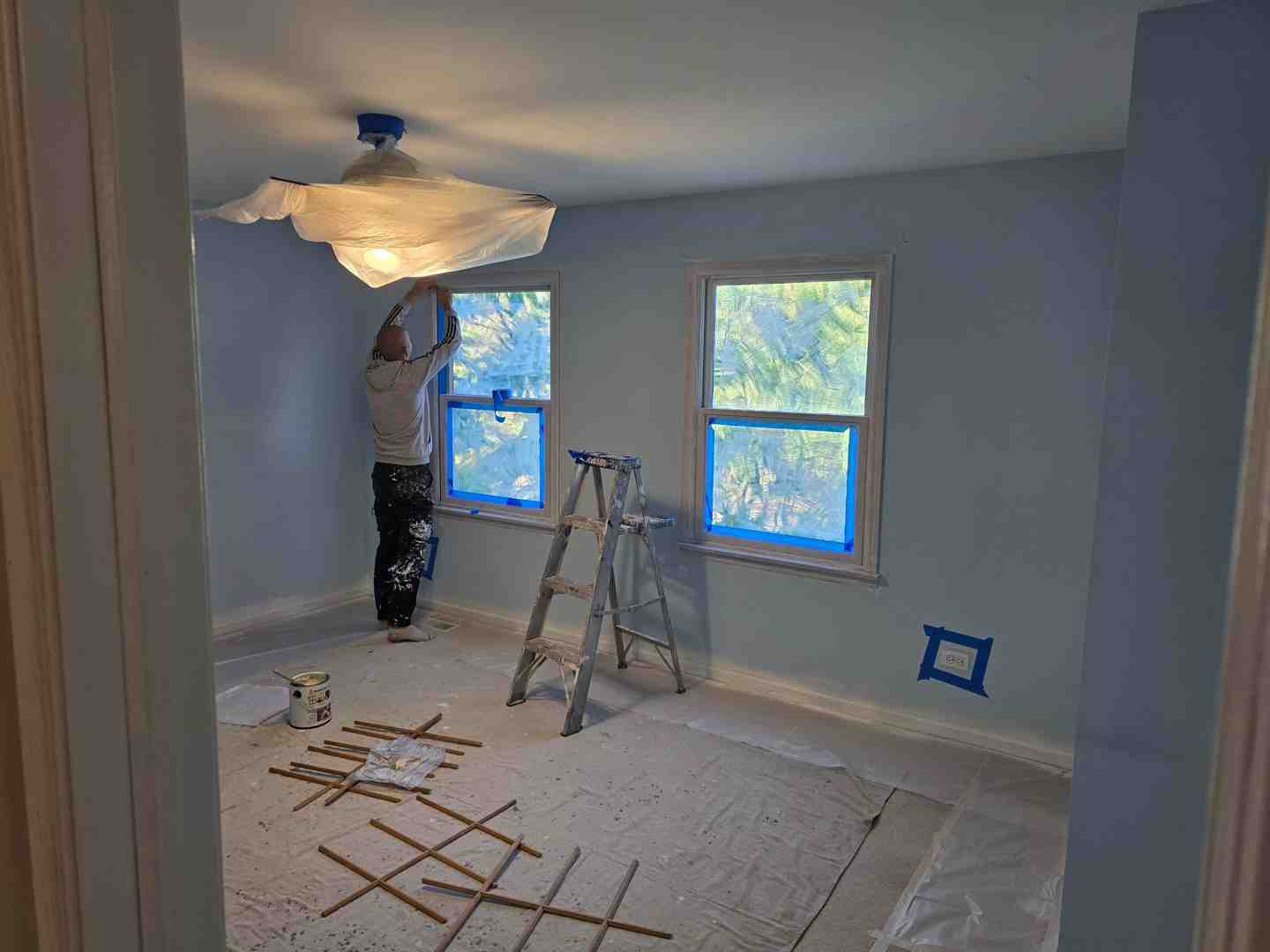
Small Dining Room Colors That Make the Most of Every Inch
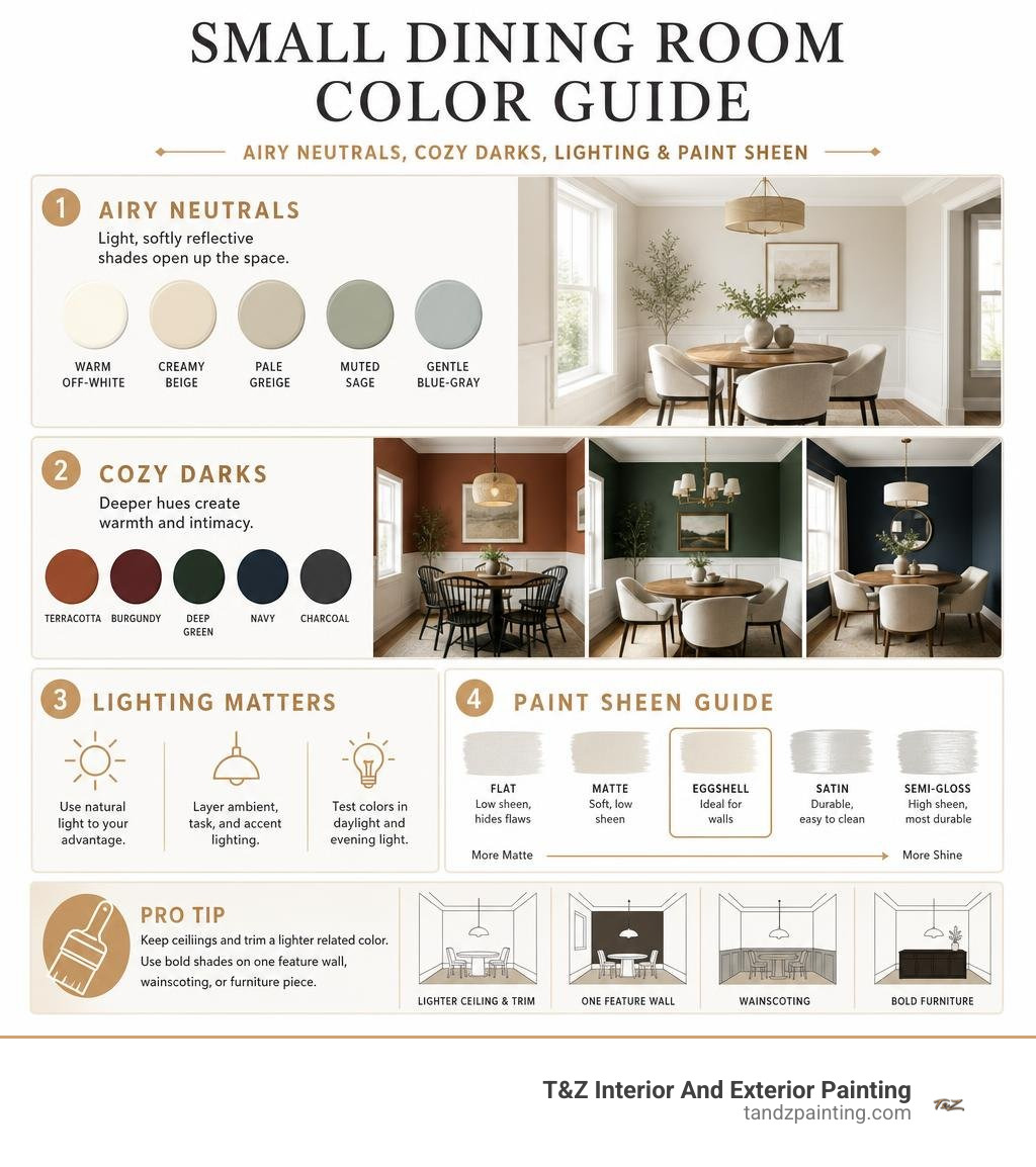
The best small dining room colors are light, softly reflective shades such as warm off-white, creamy beige, pale greige, muted sage, and gentle blue-gray. Paint the ceiling and trim in a lighter related color, use eggshell walls to reflect a little light without strong glare, and keep bold shades to one feature wall, wainscoting, or furniture piece.
The goal is not always to make a compact room look bigger. Color can also make it feel intentionally cozy, polished, and inviting for everyday meals or guests. Soft, cool-leaning hues tend to feel airy, while warm neutrals, terracotta, burgundy, and deep green create a more intimate setting when balanced with light trim, good lighting, and uncluttered decor.
Lighting changes every paint color. Test samples on more than one wall and view them in daylight and under your evening fixtures before choosing a final shade.
I am Tomasz Niemotko of T&Z Interior And Exterior Painting, a licensed and insured painting company serving Lombard, Itasca, Addison, Glen Ellyn, Oak Brook, and surrounding suburbs with more than 15 years of experience and a 5.0 Google Reviews rating. Our team helps homeowners select and apply small dining room colors with careful prep, clean workmanship, and dependable attention to detail.
Small dining room colors terms you need:
- calming colors for small bedrooms
- colors to make a room look bigger and brighter
- small guest room colors
Best Small Dining Room Colors to Maximize Visual Space
When square footage is limited, color plays a major role in how open or confined a dining space feels. By understanding Light Reflectance Value (LRV)—the percentage of light a paint color reflects—we can choose shades that bounce ambient light around the room. Colors with higher LRV ratings soften harsh shadows, blur tight corners, and create an airy atmosphere.
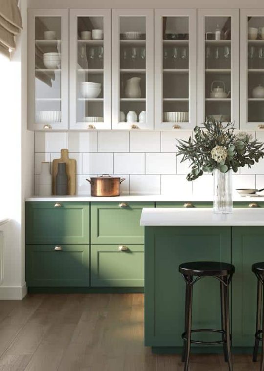
Selecting brightening paint colors for a bigger brighter room helps push visual boundaries outward. Rather than feeling boxed in, your dining nook gains a sense of fluid movement that welcomes family dinners and evening entertaining alike.
Crisp Off-Whites and Warm Neutrals
Pure, stark white can sometimes read as flat or cold in compact spaces that lack abundant natural sunlight. Instead, soft alabasters and creamy off-whites provide brightness without clinical glare. These hues carry subtle warm undertones—such as faint cream, linen, or pale wheat—that gently diffuse both daylight and chandelier glow.
A warm neutral reflects light softly while offering gentle contrast against crisp millwork or rich wood dining tables. Pairing an ivory or soft linen wall with brighter white baseboards creates clean architectural separation, giving the perception of higher ceilings and deeper walls.
Soft Sage and Muted Greige Tones
Muted greens and balanced greiges bring nature-inspired tranquility inside without overwhelming a dining area. Soft sage hues act almost as neutrals because their gray undertones soften the vibrancy of the green. This creates visual depth, making the walls recede slightly.
Greige shades blend the modern crispness of gray with the inviting warmth of beige. In our residential painting projects throughout Lombard, Elmhurst, and Wheaton, we often recommend light greiges for dining spaces because they adapt effortlessly across changing seasons and pair seamlessly with varied tabletop settings.
Trending Color Palettes for Intimate Dining Nooks in 2026
While light tones maximize visual space, many homeowners prefer to embrace the compact footprint by creating a moody, intimate jewel box. In 2026, we see a strong shift toward rich, saturated shades that turn smaller dining areas into conversation-starting destinations.
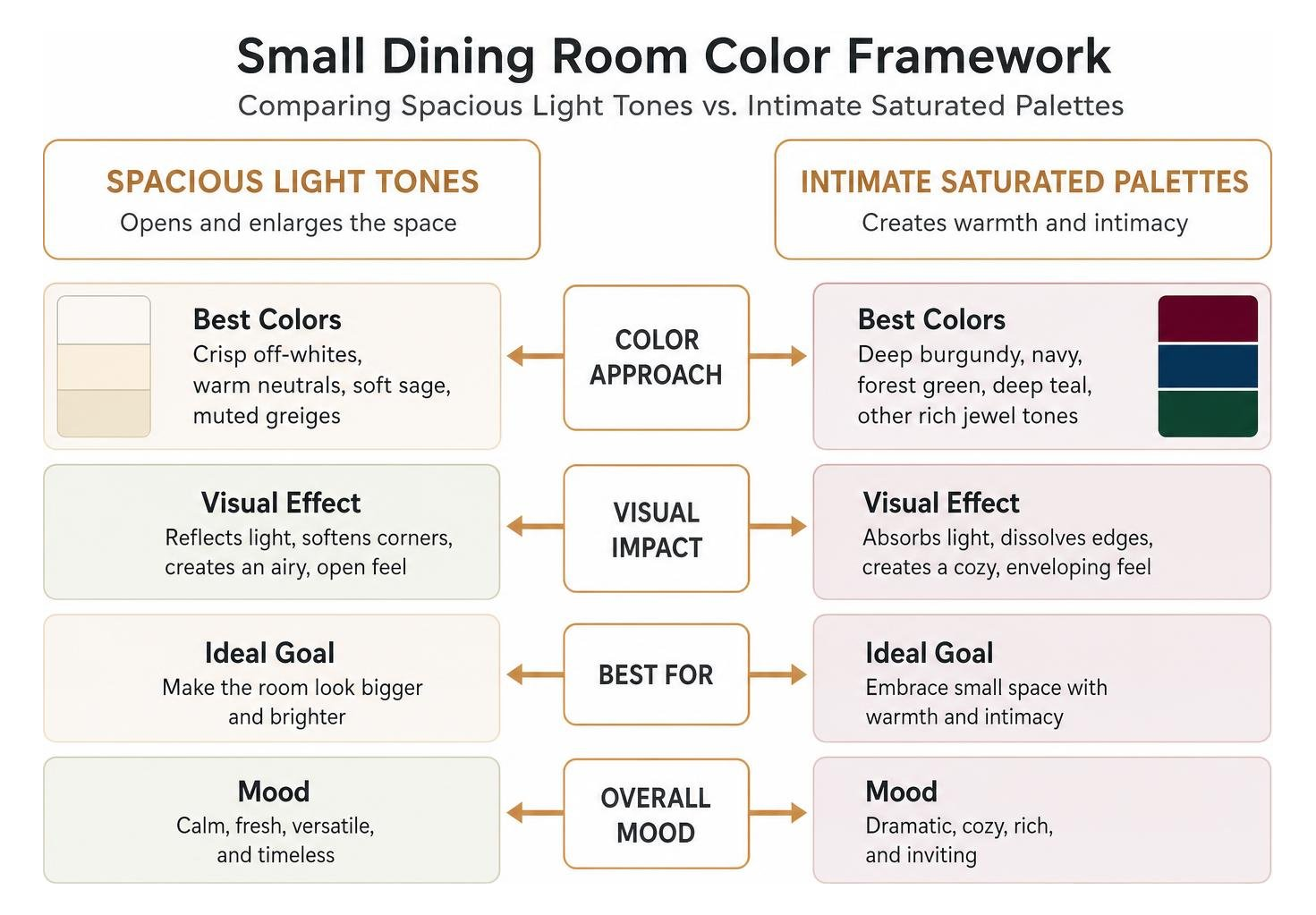
From deep, enveloping wines to energetic warm tones highlighted in recent dopamine decorating guides, your choice depends on the mood you want to curate. If you want something versatile yet distinct, exploring neutral house paint ideas alongside deeper accents creates a balanced middle ground.
Cozy Jewel Tones and Moody Burgundy Accents
Deep hues with low LRV ratings—such as rich burgundy, navy, forest green, and deep teal—absorb light to dissolve the sharp edges of a room. Under evening lighting or candlelight, a deep burgundy wall color wraps the dining area in sophisticated warmth.
To keep dark tones from feeling heavy in a compact footprint:
- Pair deep wall shades with lighter ceilings and millwork in soft oat or warm white.
- Introduce reflective accents, such as brass wall sconces or gilded mirror frames.
- Use warm-toned dining tables, like walnut or oak, to ground the palette with natural texture.
Earthy Terracotta and Joyful Dopamine Hues
Warm, sun-baked colors like terracotta, spiced persimmon, and buttery yellow naturally stimulate appetite and lively conversation. Inspired by summer dining room palette inspirations, these energetic hues inject warmth into small spaces that do not receive direct southern sunlight.
A soft nectarine or warm terracotta accent wall pairs beautifully with woven light fixtures and light wood dining sets, turning a modest breakfast nook into an uplifting dining space.
How Lighting and Paint Finishes Impact Color Perception
A paint color never exists in isolation; it reacts constantly to the light hitting its surface and the finish in which it is applied. Selecting the right sheen ensures the wall reflects just enough light to enhance color depth without highlighting drywall imperfections.
| Paint Sheen | Recommended Surface | Durability & Cleanability | Visual Effect in Small Dining Rooms |
|---|---|---|---|
| Flat / Matte | Ceilings | Low scrubbability | Absorbs glare; hides ceiling flaws; creates uniform overhead plane |
| Eggshell | Dining Walls | Medium scrubbability | Soft, low-luster glow; resists minor scuffs; balances light bounce |
| Satin | Trim, Doors, Wainscoting | High scrubbability | Smooth pearl finish; highlights woodwork details; easily wiped down |
| Semi-Gloss | High-Traffic Trim & Cabinets | Maximum durability | Distinct sheen; best for detailed architectural mouldings |
Selecting Sheens That Enhance Small Dining Room Colors
For most dining room walls, an eggshell finish provides the ideal balance between soft light diffusion and practical wipeability. Completely flat paint absorbs all light, which can make small spaces feel somewhat dull, while high-gloss finishes create distracting glare under overhead chandeliers.
Understanding the principles behind choosing the right paint sheen helps ensure your trim, walls, and ceiling work together harmoniously. Using a satin finish on baseboards and crown molding allows those architectural lines to stand out crisply against velvety eggshell walls.
Natural vs Artificial Lighting Dynamics
The direction of your windows significantly alters how wall colors render:
- North-Facing Rooms: Receive cool, bluish natural light. Cooler grays can look chilly here, so choose warmer neutrals, creams, or soft terracottas to balance the exposure.
- South-Facing Rooms: Enjoy warm, intense sunlight all day. These spaces handle cooler blues, soft sages, and crisp off-whites exceptionally well.
- Artificial Lighting: Dining rooms rely heavily on chandeliers and wall sconces. Bulbs with a warm white color temperature (around 2700K to 3000K) flatter both skin tones and food, enriching warm undertones in your paint.
Strategic Layout Techniques: Accent Walls and Open-Concept Flow
In compact homes or modern layouts, the dining area often shares visual space with the kitchen or living room. Strategic color placement helps define the dining zone as a distinct, purposeful area without building physical walls.
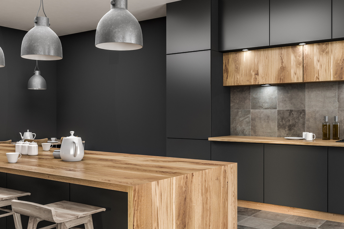
Coordinating Small Dining Room Colors with Adjacent Living Spaces
When dining and living spaces share sightlines, color harmony is essential. You do not need to paint every area identical shades; instead, adopt a cohesive palette using related tones. Incorporating modern living room painting ideas that share undertones with your dining nook creates an uninterrupted, fluid transition throughout the home.
For instance, if your living room features a warm greige, carrying a lighter version of that greige onto the dining walls—or introducing a complementary muted green feature wall—creates clear zoning while preserving visual unity.
Ceiling Color and Two-Tone Delineation Tricks
The ceiling is often referred to as the “fifth wall,” and treating it thoughtfully can completely transform room proportions. Exploring proven ceiling and wall color combinations gives you clever options to manipulate spatial perception:
- Ceiling Lift: Painting the ceiling a shade lighter than your walls draws the eye upward, making standard-height ceilings feel taller.
- Cozy Envelope: Painting the ceiling the exact same saturated color as the walls blurs room boundaries, producing an intimate dining environment.
- Two-Tone Walls: Applying a deeper shade on lower wainscoting or the bottom third of the wall, paired with a lighter neutral above, grounds the dining table while keeping the upper visual field open and bright.
Key Mistakes to Avoid When Painting a Compact Dining Area
Small rooms leave little room for error. Avoiding these common missteps ensures a clean, polished finish:
- Skipping In-Room Sampling: Paint swatches look entirely different on small chips under store lighting than they do on your dining walls across morning light and evening dinners.
- Ignoring Trim and Flooring Undertones: A cool gray wall paired with honey-oak floors or warm beige millwork can clash uncomfortably. Always check undertone compatibility.
- Overusing High-Gloss on Imperfect Walls: Glossy finishes highlight every minor drywall bump, patch, or texture inconsistency. Reserve higher sheens for properly prepped wood trim.
- Overcrowding with High-Contrast Patterns: Sharp, contrasting accent walls on multiple sides can visually chop up a small footprint. Keep your palette restrained to two or three cohesive tones.
Frequently Asked Questions About Dining Room Paint Schemes
Can dark paint colors work well in a small dining room?
Yes. Deep navy, charcoal, forest green, and dark burgundy can turn a small dining room into a luxurious, intimate space. Because dining rooms are primarily used in the evening under ambient lighting, dark walls create a dramatic, cozy backdrop. To keep the space balanced, maintain light ceilings, incorporate warm light fixtures, and use mirrors to reflect ambient glow.
What paint sheen is best for small dining room walls and trim?
An eggshell finish is typically best for small dining room walls because it offers a soft, low-luster appearance that resists scuffs from dining chairs and wipes clean easily. For baseboards, chair rails, and crown molding, a satin or semi-gloss finish provides durability and crisp architectural contrast.
Should open-concept dining and living areas share the exact same color?
They do not need to be identical, but they should share complementary undertones. Using tonal variations—such as a slightly deeper or lighter shade from the same color strip—or delineating the dining nook with painted wainscoting defines the space while maintaining a cohesive look across open floor plans.
Conclusion
Choosing the right palette transforms a small dining room from a cramped eating space into an inviting, character-filled setting for shared meals. Whether you select light, reflective neutrals to maximize visual space or embrace deep jewel tones for evening intimacy, thoughtful preparation and precise application make all the difference.
At T&Z Interior And Exterior Painting, we bring over 15 years of dedicated residential painting experience to homeowners across Lombard, Addison, Glen Ellyn, Oak Brook, Downers Grove, and surrounding communities. As a fully licensed and insured team with a 5.0 Google Reviews rating, we focus on meticulous surface preparation, clean job sites, and high-quality finishes that endure. If you are navigating small house painting challenges, our experienced painters are ready to help you bring your vision to life.