
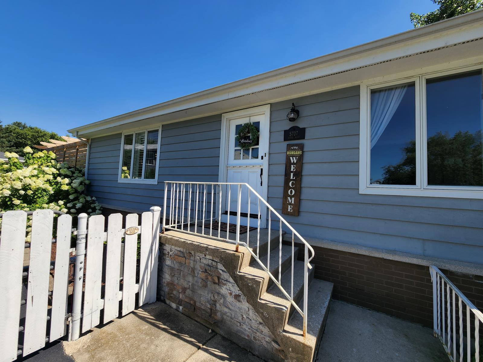
House Colors for Small Houses That Make a Big Impression
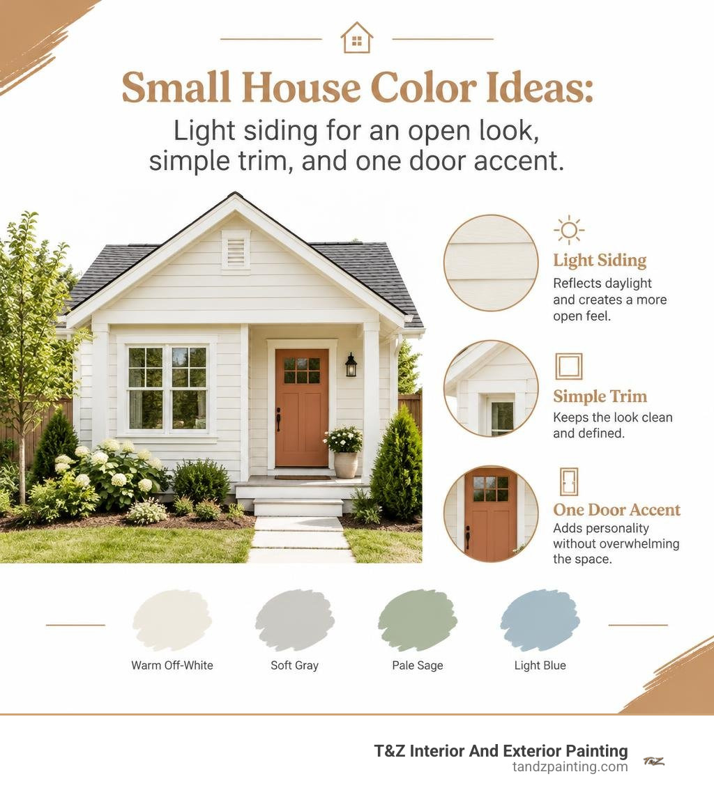
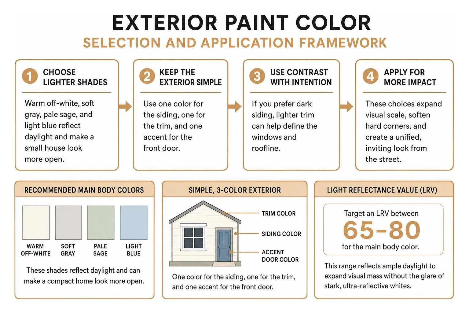
The best house colors for small houses are warm off-white, soft gray, pale sage, and light blue. These shades reflect daylight and can make a compact home look more open. Keep the exterior simple: choose one color for the siding, one for the trim, and one accent for the front door. If you prefer dark siding, lighter trim can help define the windows and roofline.
I’m Tomasz Niemotko, owner and founder of T&Z Interior And Exterior Painting, a licensed and insured painting contractor based at 1101 S Columbine Ave, Lombard, IL 60148. Founded in 2009, our company brings over 15 years of exterior painting experience to helping homeowners choose house colors for small houses.
House colors for small houses vocabulary:
- exterior paint colors for small cottage
- small house paint design outside
- exterior painting compact houses
Visual Impact: How House Colors for Small Houses Expand Curb Appeal
Selecting the right exterior palette involves understanding siding proportions, natural daylight interaction, and visual scaling. When approaching a compact residence, the human eye processes the facade as a single cohesive block. Applying proven exterior painting techniques for compact homes allows you to manipulate contrast ratios and sightlines, giving the impression of greater architectural volume while controlling harsh sun glare.
Lighter shades bounce daylight back into surrounding sightlines, effectively softening hard corners and making siding surfaces feel expansive. Conversely, overly complex, high-contrast wall breaks can chop up a small facade, making it feel boxy or confined. By establishing smooth transitions across your primary surfaces, the exterior feels unified and inviting from the street.
Light Reflectance Value and Perceived Exterior Scale
Light Reflectance Value (LRV) measures the percentage of visible light a paint color reflects on a scale from 0 (pure black) to 100 (pure white). For small homes, targeting an LRV between 65 and 80 for the main body color provides the ideal balance. Colors in this range reflect ample daylight to expand visual mass without causing the blinding glare associated with stark, ultra-reflective whites.
Sun orientation directly influences how your paint reads across different times of day:
- South-Facing Walls: Receive intense, warm sunlight throughout the day. Soft neutrals with an LRV around 68 to 72 prevent the siding from washing out under direct rays.
- North-Facing Walls: Receive cool, diffused light that can make cool grays appear icy or shadowy. Warm off-whites with creamy undertones counteract this effect.
- East-Facing Facades: Catch bright morning light and softer afternoon shade, benefiting from balanced, adaptable hues.
- West-Facing Facades: Absorb hot, golden evening rays, where low-luster finishes and balanced undertones help manage reflectivity.
Exploring professional design resources such as Benjamin Moore exterior color inspiration shows that warm, light-reflective neutrals create an illusion of greater volume while maintaining residential comfort across shifting daylight conditions.
The Three-Color Rule for Compact Facades
A common mistake on compact homes is applying too many competing paint shades. Visual clutter fragments a small facade, diminishing curb appeal. Adhering to the standard three-color rule preserves balance, ensures clean sightlines, and brings out your home’s natural architectural lines.
| Scheme Element | Proportion | Function on Compact Facade | Recommended Placement |
|---|---|---|---|
| Primary Body | 60% | Sets the main visual foundation; reflects daylight to expand size | Main siding, brick, or stucco |
| Secondary Trim | 30% | Frames structural details; defines windows, rooflines, and porch posts | Window casings, fascia, soffits, corner boards |
| Accent Color | 10% | Establishes a clear focal point; draws the eye directly toward the entryway | Front entry door, selective architectural shutters |
Using more than three distinct colors on a small exterior often creates visual confusion. Keeping the secondary trim within a 20 to 30 percent contrast range against the main siding gives you clean structural definition without chopping up the facade.
Top Exterior Palettes to Boost Compact Curb Appeal
A well-planned exterior palette aligns with architectural rhythm, seasonal lighting changes, and existing fixed masonry. In communities like Lombard, Glen Ellyn, Elmhurst, and Wheaton, neighborhood homes range from classic mid-century ranches to cozy frame bungalows. Reviewing proven stunning exterior paint combinations ensures your color selections complement fixed brick pathways, stone foundations, and local weather patterns.
Airy Whites and Warm Neutrals as House Colors for Small Houses
Airy whites and warm neutrals remain the most reliable house colors for small houses because they maximize light bounce and naturally expand the look of compact walls. Warm greiges, creamy off-whites, and soft beige hues avoid the clinical look of pure stark white while delivering excellent curb appeal.
Proven neutral selections include:
- Warm Off-Whites: Tones like White Dove OC-17 and Alabaster SW 7008 reflect natural light beautifully while providing a welcoming, soft appearance.
- Balanced Greiges: Shades like Revere Pewter HC-172 bridge gray and beige, complementing both red-brick foundations and warm roof shingles.
- Soft Creams: Warm wheat and cream tones add brightness to shaded lots without looking stark.
Homeowners can review options in the Sherwin-Williams exterior house color guide to match warm neutral undertones with existing stone accents and roofline materials.
Nature-Inspired Greens and Coastal Blues for Visual Depth
Soft greens and muted blues introduce visual depth and organic stability. These colors connect the home naturally with surrounding front-yard landscaping, making the architecture feel settled rather than imposing.
Top nature-inspired siding shades for compact homes include:
- Pale Sage Green: Blends seamlessly with lawn foliage and creates an open, garden-like setting.
- Slate Blue: Offers crisp, calming depth that pairs naturally with white trim and gray roofing.
- Hazel Green: A grounded earthy mid-tone that works well on homes with heavy tree cover.
- Muted Coastal Blue: Reflects sky tones, adding brightness to homes in open, sunny lots.
These mid-tone colors prevent visual noise while establishing a clean, tranquil facade that stands out gracefully from the curb.
Modern Dark Accents and Earthy Mid-Tones
While light body colors visually expand a home’s footprint, selective dark accents add contrast and structural definition. Incorporating deep charcoal, rich navy, or dark graphite on select components grounds the structure.
Strategic placements for deeper tones include:
- Front Entry Doors: A rich navy or warm red front door creates an immediate focal point that draws the eye directly to the entrance.
- Window Shutters: Charcoal or deep bronze shutters outline window openings cleanly against light siding.
- Porch Steps and Foundations: Grounding the bottom visual band of a house with a deeper earthy hue makes upper walls feel taller and more expansive.
Homeowners can explore targeted exterior accent strategies for small homes to incorporate bold contrasting tones without shrinking the overall look of the property.
Architectural Styles and Proven Color Combinations
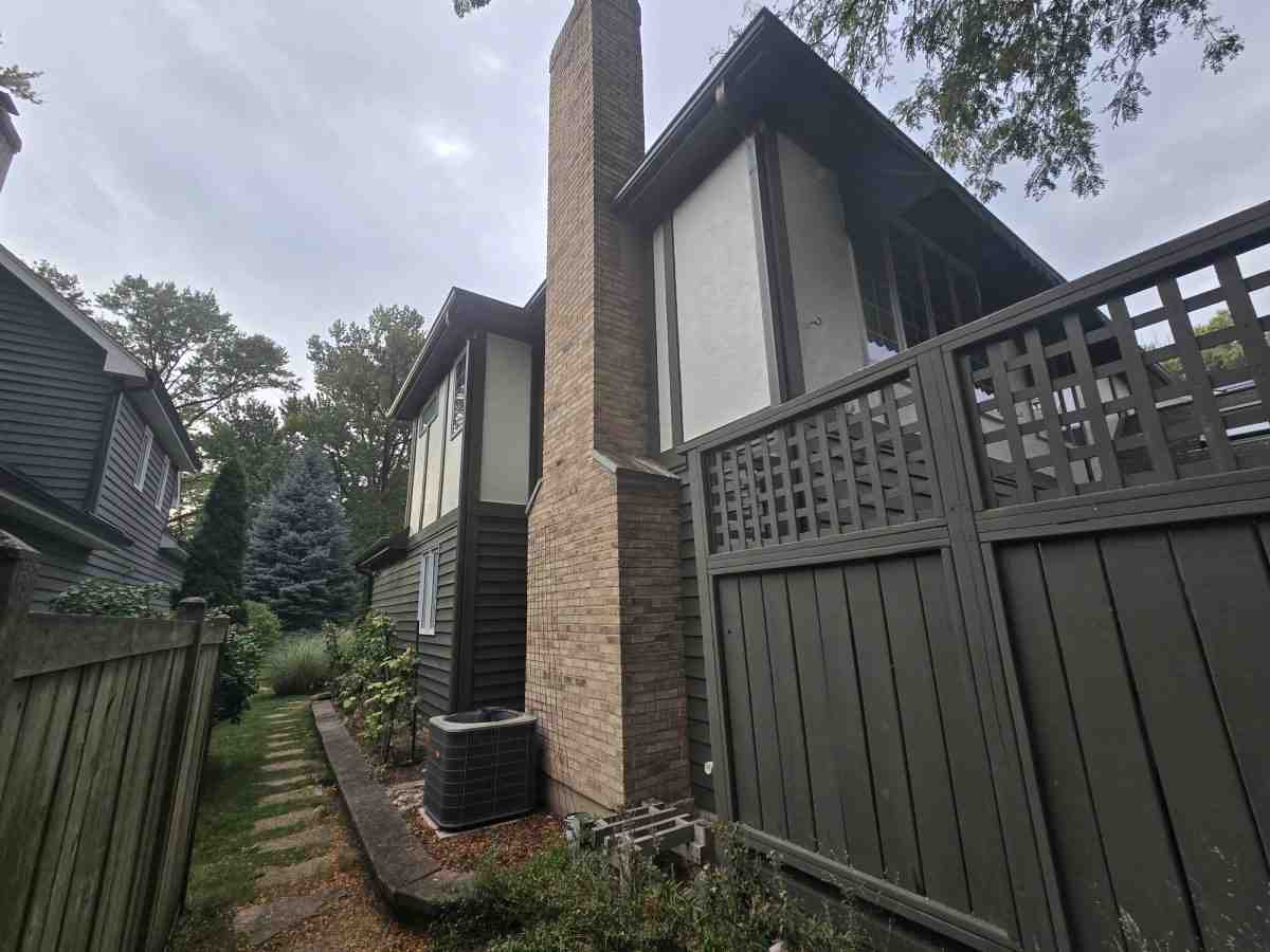
Different home styles require specific approaches to exterior colors. Matching your paint palette to the architectural geometry of your home ensures that details like eaves, porch columns, and window casings are highlighted properly. Homeowners can reference our comprehensive exterior curb appeal guide to evaluate how specific architectural styles interact with exterior coatings.
Classic Bungalow and Cottage Schemes
Craftsman bungalows and historic cottages feature distinct details such as exposed rafter tails, wide front porches, and mixed-material siding. Enhancing these details requires balanced colors that showcase craftsmanship without overwhelming the facade:
- Earth & Cream Bungalow: Sage green or warm greige siding paired with crisp off-white columns and a natural wood-stained front door.
- Cottage Charm: Soft cream siding, muted pastel blue accents, and traditional Haint Blue porch ceilings that add historic character.
- Limewashed Brick: Applying breathable limewash or light mineral coatings to older brick exteriors softens heavy red tones and creates a cohesive, light-reflective cottage look.
Reviewing curated cottage exterior color palettes provides helpful inspiration for styling historic porches, pergolas, and decorative wood trim.
Selecting Trim, Sheen, and Accent House Colors for Small Houses
Choosing the right paint sheen is just as important as selecting the right color. Sheen affects how light reflects off your siding, how easily surfaces can be cleaned, and how well the paint withstands seasonal weather shifts in towns like Downers Grove, Carol Stream, Addison, and Schaumburg.
- Main Siding (Satin or Low-Lustre): Provides light washability and subtle daylight reflection while hiding minor siding imperfections and preventing harsh glare.
- Trim, Fascia, and Soffits (Semi-Gloss): Adds crisp definition around window casings and rooflines while offering superior moisture resistance against seasonal rain and snow.
- Front Entry Doors (Semi-Gloss or Gloss): Creates a polished accent finish that resists fingerprints and everyday wear.
Proper sheen management balances visual depth across the facade while making sure your exterior remains durable and easy to maintain throughout the year.
Frequently Asked Questions About House Colors for Small Houses
What exterior paint colors make a small house look bigger?
Light neutrals with a Light Reflectance Value (LRV) between 65 and 80 are the most effective colors for making a small house appear larger. Warm off-whites, light grays, pale sage greens, and soft coastal blues reflect natural daylight, brightening shadowed areas and creating an open, expansive appearance from the street.
Should small house exteriors be light or dark?
Light colors are generally recommended for the main body of small houses because dark shades absorb light and can make compact facades look smaller. However, dark tones can be used effectively on accents, such as front doors, window shutters, and lower foundation bands, to add visual depth and architectural interest without compressing the home’s overall shape.
How many colors should you use on a small house exterior?
A small house exterior should follow the three-color rule: one primary color for the main siding (about 60%), one secondary color for the trim, fascia, and window frames (about 30%), and one accent color for the front door or shutters (about 10%). Limiting your palette to three coordinated colors prevents visual clutter and keeps the facade clean and balanced.
Conclusion

Choosing the right exterior colors can completely transform a compact home, maximizing its perceived size and highlighting its best architectural features. By sticking to balanced light-reflective neutrals, adhering to the three-color rule, and applying durable, low-luster sheens to siding and trim, you can give your property lasting curb appeal that holds up year after year.
If you are dealing with challenging architectural details, review our guide on overcoming small house painting challenges for practical preparation and layout advice.
At T&Z Interior And Exterior Painting, our experienced painters deliver quality results using top-brand materials and clear communication on every project. Founded in 2009 by Tomasz Niemotko, our team brings over 15 years of experience to homeowners across Lombard, Villa Park, Downers Grove, Wheaton, Elmhurst, Oak Brook, Carol Stream, and surrounding communities. We are a fully licensed and insured contractor, BBB accredited, hold a 5.0 Google rating with 85+ reviews, and back our exterior and interior painting work with a 2-year warranty.
Ready to elevate your home’s curb appeal with a professional exterior refresh? Request a free estimate today by visiting tandzpainting.com or calling our local team directly at (224) 240-0054.