
Small Home Office Paint Colors That Make the Space Work
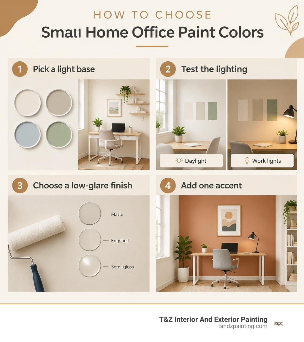
For a small home office, start with warm white, soft greige, pale blue, or muted sage. These colors keep the room feeling open without making it look stark. Choose eggshell for most walls, or matte if glare from a window or desk lamp is a concern. Want more energy? Add muted yellow or terracotta to one desk wall or alcove rather than every wall.
The best choice depends on the light in your room. Test samples beside your desk and in a darker corner, then check them in daylight and under your work lights before you paint.
I’m Tomasz Niemotko of T&Z Interior And Exterior Painting. Through more than 15 years of residential painting work in and around Lombard, I’ve helped homeowners choose small home office paint colors that suit their light, layout, and daily use.
Key small home office paint colors vocabulary:
- calming colors for small bedrooms
- colors to make a room look bigger and brighter
- small home paint ideas
Best Small Home Office Paint Colors to Maximize Focus and Perceived Space
Working in a compact space—whether an adapted spare room, a converted walk-in closet, or an alcove nook—comes with unique spatial hurdles. In a small room, every wall surface sits directly in your field of view. Light reflections, shadows, and color undertones directly influence whether you feel comfortably focused or hemmed in.
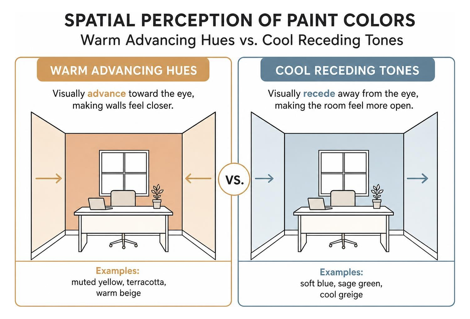
To make a compact study feel expansive, color theory relies on the concept of receding versus advancing hues. Cool tones—such as soft slate blues, silvery greens, and cool greiges—visually recede from the eye. This pushes room boundaries outward and makes compact dimensions feel airy.
A critical metric when evaluating paint swatches is the Light Reflectance Value (LRV). Measured on a scale from 0 (pure black absorbing all light) to 100 (pure white reflecting all light), LRV tells you how much ambient light a color bounces back into the room:
- High LRV (70–85): Excellent for dark corners, but pure, cool whites above 85 LRV can look stark and clinical under direct LED desk lamps.
- Balanced LRV (55–70): The sweet spot for compact workspaces. It prevents eye strain, softens shadows, and maintains crisp contrast against computer monitors.
- Low LRV (Below 40): Best suited for dedicated focus alcoves or grounded accent walls when paired with layered lighting.
Applying proven small home paint ideas that maximize light and visual flow ensures that your study feels like an open, natural extension of your living space rather than a cramped box.
Psychology of Small Home Office Paint Colors on Cognitive Performance
Wall color is an active cognitive tool. Studies in workplace environmental psychology highlight how specific color wavelengths influence focus, mental fatigue, and error rates throughout the workday.
- Cool Blues for Analytical Accuracy: Soft blues lower heart rates and support sustained mental focus. Cool tones are ideal for data management, coding, accounting, or administrative workflows.
- Muted Greens for Reducing Visual Fatigue: Green sits at the center of the visible light spectrum. Because the human eye requires zero retinal adjustment to view it, sage and moss tones rest the optic nerve, reducing screen-induced fatigue during long shifts.
- Muted Yellows for Creative Energy: Soft ochres or buttercream yellows gently stimulate mental activity without overwhelming the senses.
- Warm Terracottas for Grounded Focus: Earthy clays provide warmth and coziness, establishing a rich, distraction-free environment for writers and strategic planners.
Reviewing research on workspace color productivity reinforces that selecting a color tailored to your daily tasks can directly improve your focus and reduce afternoon burnout.
Natural and Artificial Lighting Dynamics in Compact Workspaces
A paint swatch that looks like a warm biscuit in a showroom can quickly turn into a flat gray under certain lighting conditions. The orientation of your windows and the color temperature of your light bulbs dictate how your walls behave.
For artificial illumination, keep your overhead fixtures and task lamps between 3000K and 3500K. Fixtures under 2700K cast a heavy orange glow that muddies cool blues, while lamps over 4000K produce harsh commercial glare. Balancing your bulbs with targeted brightening paint colors for small spaces keeps your office bright and balanced from morning to night.
Curated Palettes: Vibrant Accents, Soft Sage, and Modern Neutrals
Modern interior design balances biophilic elements with warm, welcoming minimalism. Instead of stark office setups, homeowners are embracing restorative earth tones, grounded neutrals, and structured accents that blend style with all-day comfort.
A versatile approach is building a five-part palette around sage green:
- Dominant Wall Color: Soft, silvery sage green (LRV ~50–60)
- Ceiling & Window Trim: Warm off-white (LRV ~82–88)
- Secondary Recess or Alcove: Pale greige or oatmeal (LRV ~65)
- Structural Accent: Deep charcoal or blackened bronze (used on floating shelves, picture frames, or metal hardware)
- Organic Balance: Natural maple, white oak, or walnut wood tones
Exploring Dulux Soulful Sage color palette concepts reveals how soft greens pair effortlessly with natural textures, keeping a compact study airy without feeling sparse.
Neutral vs Vibrant Small Home Office Paint Colors for Video Calls and Zoning
With video conferencing a staple of the modern workday, your wall color doubles as your digital backdrop. High-contrast pure white walls reflect excessive light, causing webcams to underexpose your face. Conversely, pitch-black walls can overwhelm camera sensors in small spaces.
Mid-tone neutrals—such as accessible beige, soft taupe, and quiet luxury greiges—offer a polished, distraction-free background on screen. If you prefer high-energy colors, incorporate vibrant tones like terracotta or gold as focused desk-facing accents, while keeping your camera-facing wall in a flattering, mid-range neutral.
| Palette Category | Core Color Example | LRV Range | Ideal Work Style | Video-Call Background Suitability |
|---|---|---|---|---|
| Quiet Luxury Neutral | Accessible Beige / Warm Oatmeal | 58–64 | Client Management, Legal, Corporate | Excellent; balanced exposure, flatters skin tones |
| Biophilic Calm | Soft Silver-Sage / Muted Eucalyptus | 52–60 | Creative Design, Research, Writing | Outstanding; zero glare, professional and serene |
| Focused Analytical | Pale Slate / Muted Denim Blue | 54–62 | Data Analysis, Coding, Accounting | High; crisp contrast without harsh camera washout |
| Dopamine Energy | Warm Ochre / Spiced Terracotta | 36–48 | Marketing, Ideation, Studio Art | Moderate; best used behind monitors, not webcams |
| Deep Immersion | Velvet Charcoal / Classic Navy | 10–22 | Podcasting, Audio/Video Production | Good; requires focused foreground lighting |
For homeowners looking for stylish ideas for adjacent spaces, our guides on cool blues for small bedrooms and small dining room color ideas show how cohesive palettes create a seamless flow across your floor plan.
Professional Palette Combinations for Compact Multi-Use Rooms
When an office shares space with a guest room or sitting area, paint helps establish clear functional zones. A two-tone perimeter—where the lower third of the wall is painted in a grounded tone and the upper section in an airy off-white—visually expands narrow walls while protecting high-contact baseboard areas.
For dedicated work alcoves, painting the desk niche in a slightly deeper shade creates clear separation from the rest of the room. When navigating complex multi-use layouts, scheduling an expert color consultation and palette selection helps you choose balanced color transitions tailored to your home’s layout.
Selecting the Ideal Paint Sheen and Finish for Small Offices
Paint sheen directly affects light reflection, wall durability, and how smoothly your walls appear. In close quarters, high-gloss finishes bounce harsh reflections from computer screens and desk lamps, causing eye strain and highlighting minor drywall imperfections.
Matte and Eggshell Sheens for Wall Surfaces
For main wall surfaces in small offices, low-luster sheens are the professional standard:
- Matte (Flat/Dead Matte): Absorbs ambient light and diffuses glare from windows and task lamps. It also offers subtle acoustic benefits by softening sound reflections during calls. Using low sheen paint to hide drywall imperfections is ideal for older plaster or uneven drywall surfaces.
- Eggshell: Provides a soft, velvety luster with enough washability to handle occasional scuffs from desk chairs, sliding storage bins, and shoes.
To find the right balance between washability and light diffusion, read our guide on choosing the right sheen for every room.
Semi-Gloss and Satin for Built-Ins and Trim
While walls benefit from low sheen, architectural trim, window sills, and built-in desks require extra durability:
- Satin: Ideal for built-in bookcases, vertical shiplap, and interior doors, offering a smooth finish that resists fingerprints and dust.
- Semi-Gloss: Perfect for baseboards, window casings, and painted desk aprons that need regular cleaning and scuff resistance.
Strategic Painting Techniques: Accent Walls, Color Drenching, and Zoning
How you apply paint can reshape the visual proportions of a compact workspace just as effectively as the colors you choose.
Maximizing Dimensions with Strategic Accent Walls
In a compact room, placing a dark accent wall in the wrong spot can make the space feel narrow. For the best balance:
- The Desk Anchor: Paint the wall behind your monitor in a deeper hue (like navy or charcoal) while keeping the side walls light. This draws the eye forward, adding depth to the room.
- The Webcam Backdrop: If you paint the wall behind your chair for video calls, make sure you have adequate forward lighting so your camera balances exposure properly.
To make the most of your room’s layout, review our advice on accent walls that maximize room dimensions.
Color Drenching Ceilings and Walls to Erase Room Boundaries
Color drenching—painting the walls, ceiling, baseboards, and window trim in the exact same color—is one of the most effective techniques for compact rooms.
When the ceiling matches the walls, your eyes no longer register a sharp visual dividing line at the top of the room. The perimeter softens, making low ceilings feel taller and the overall space feel unified. Learn more about this modern technique in our guide to painting ceiling and walls the same color.
Common Small Office Painting Mistakes to Avoid
Avoiding these frequent missteps will help you get the best results from your painting project:
- Defaulting to Stark Pure White: High-LRV cool whites (above 88) can feel flat and clinical in small spaces with low natural light.
- Skipping 48-Hour Swatch Testing: A color swatch can change dramatically between bright morning light, afternoon shade, and evening lamps.
- Using High-Gloss on Broad Walls: Glossy walls reflect distracting hot spots from computer monitors and desk lamps.
- Ignoring Trim and Ceiling Harmony: Painting bright white trim against soft, muted walls can create distracting visual breaks in a small room.
- Overlooking Surface Preparation: Small spaces put walls close to eye level, making unpatched drywall dents and rough patches easy to spot.
Frequently Asked Questions about Small Home Office Paint
What is the best paint color for video calls in a small home office?
Sherwin-Williams Sea Salt (LRV 63) and Benjamin Moore Quiet Moments (LRV 61) are two of the most reliable choices for video calls. These muted, silvery blue-greens soften shadows, prevent digital camera blowout, and provide a polished, professional backdrop on screen.
Does painting a small home office dark make it feel smaller?
Not necessarily. While light colors bounce light to make a space feel open, deep tones like charcoal, dark teal, or rich navy can blur the corners of a room, creating a sense of cozy depth. If you choose a darker color, make sure to pair it with layered lighting—such as warm task lamps, wall sconces, or LED desk bars.
Should the home office ceiling match the wall color in tiny spaces?
Yes. In small home offices or work alcoves, painting the ceiling the same shade as the walls removes sharp visual breaks. This seamless transition tricks the eye into seeing continuous height, making tight spaces feel noticeably more open.
Conclusion
Transforming a compact study into a productive, comfortable workspace comes down to thoughtful color selection, the right sheen, and clean execution. Whether you prefer restorative sage greens, tailored neutrals, or a rich accent wall, the right palette makes every work hour more enjoyable.
At T&Z Interior And Exterior Painting, our experienced crews bring more than 15 years of residential painting expertise to homeowners in Lombard, IL, and neighboring communities like Glen Ellyn, Downers Grove, Wheaton, and Elmhurst. We are fully licensed and insured, maintain a 5.0 Google Reviews rating, and back our expert craftsmanship with a comprehensive 2-year labor warranty. From thorough drywall prep to clean, precise finishes, we deliver quality results that stand the test of time.
If you are ready to update your workspace, learn how we help homeowners with overcoming small house painting challenges and contact us today to schedule your consultation.